< Back to posts
Marta Altés
Spain
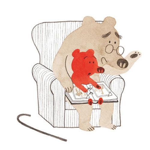
Marta Altés worked as a graphic designer in Barcelona before moving to the UK to complete a Masters in Children's Book Illustration at Cambridge School of Art. Since graduating, Marta has written and illustrated a number of successful picturebooks for UK publishers, and she was nominated for the prestigious Kate Greenaway Medal.
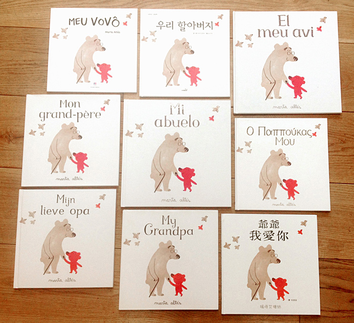
In this post, Marta talks about the creation of ‘My Grandpa’. This beautifully illustrated, poignant picturebook was originally published in the UK by Macmillan Children's Books, and has been translated into numerous languages including Catalan, Korean and Japanese.
Marta: ‘My Grandpa’ is a very special book to me. I wrote and illustrated it when I was still studying the MA in Children's Book Illustration in Cambridge. It was one of my last projects along with ‘I am an artist’. I worked on both at the same time. There were a few crazy months of non-stop working and not sleeping before we finished the MA. But it didn't matter! I was enjoying it a LOT! After quitting my job as a graphic designer, it was the first time I could spend AAAAALL DAY drawing and writing!
‘My Grandpa’ was the result of a combination of a few circumstances. Different things came together at the right time...
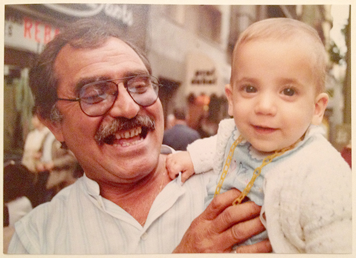
The very first one, of course, was missing my grandpa. He was the best. He passed away years ago... I remember mostly the good times my brother and I spent with him, but I also remember how in his later days he wouldn't recognise me, and how difficult that was.
Before starting the last module of the MA, Pam Smy, who is an amazing illustrator and is now a good friend, gave a very interesting lecture about picture books that deal with difficult issues.
And finally, what probably made me decide to start this project was seeing how a friend's nephews reacted in front of their very old grandpa. He suffered from Alzheimer's, and you could see how the kids could tell that there was something 'strange'. They didn't want to play with him, hug him, or even be close to him... His eyes looked extremely sad when this happened. It was heartbreaking.
Something clicked inside me, and I wanted to write a story about it.
So I started thinking about what my grandpa used to do. About his life, what he liked to do... I wrote all the memories I had of him. That led me to think about how special the relationship between grandparents and their grandchildren is. And how happy they make each other.
I wanted the story to be about my grandpa, so I tried to draw him. But it didn't go well. Although, to be honest, I didn't try very hard. I felt I needed some distance between the story and my personal experience. That's why I decided to pick bears for my characters.
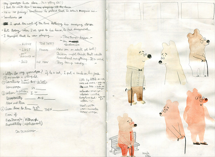
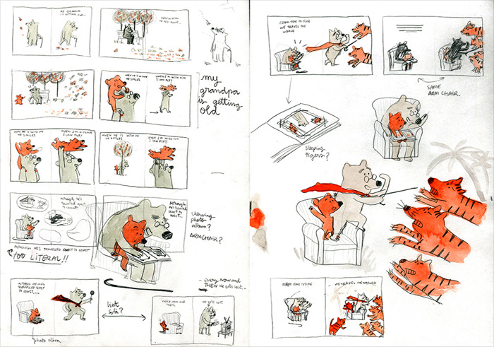
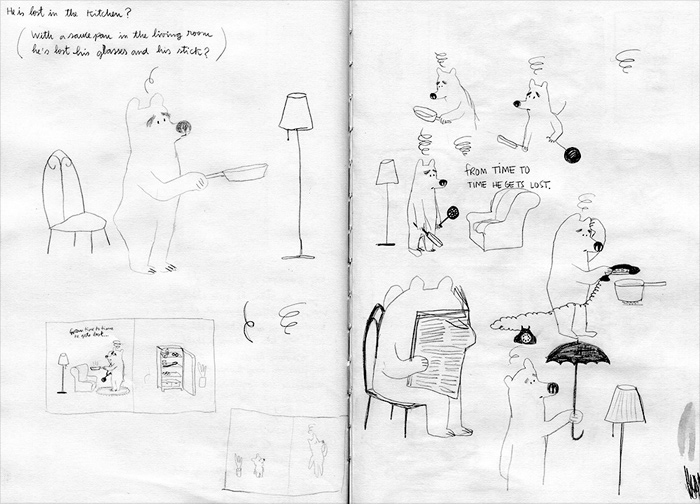
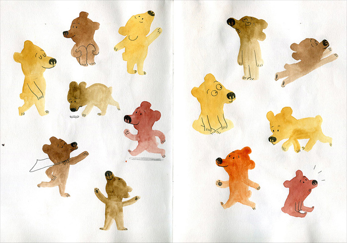
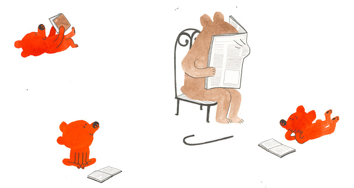
The next thing I did after writing down some memories and ideas, was to start drawing the two characters in different situations. Always trying to think about the positive things that grandpa and grandson give to each other.
After lots of juggling, text and images came together to tell the story.
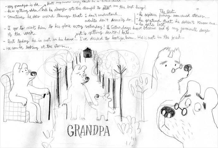
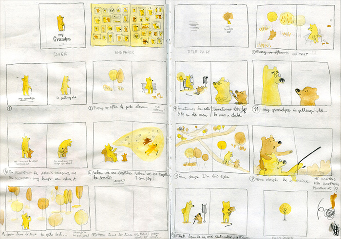
I worked on the text and the illustrations at the same time. And when I had some compositions that I liked, I started working on the storyboard. I love storyboards!
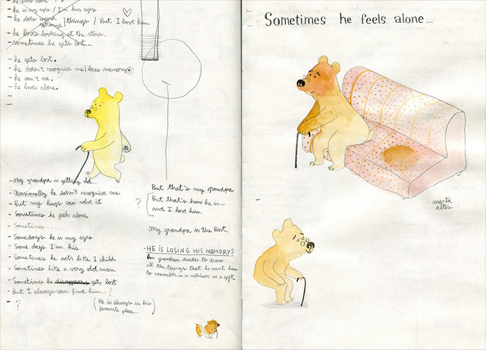
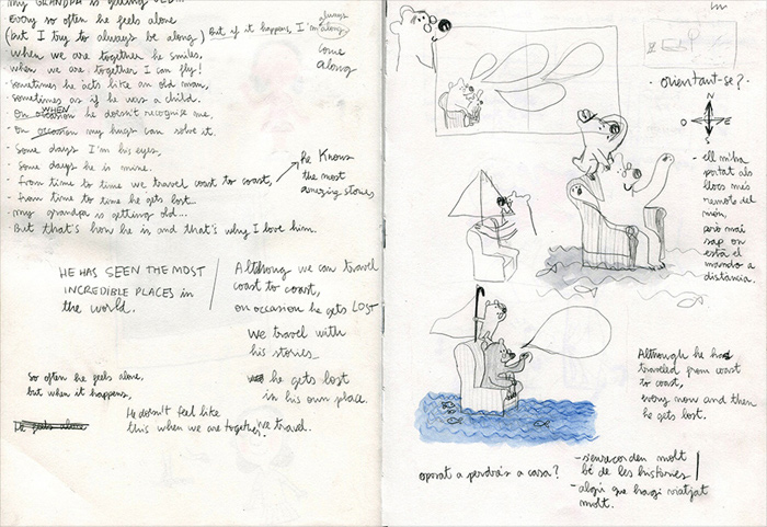
I don't remember how many times I wrote the story. I have endless pages in my sketchbooks with almost the same text. I don't know why, but I prefer writing stories in my sketchbooks than I do on the computer.
English is not my first language, but I do try to write my stories in English. It's very challenging!
The sentences I used were very short, but every word had to count. I really enjoyed it, although at some points I felt I was going a bit crazy with all the text options. That's why it was so good to be working on my ‘I am an artist’ book at the same time. When I got to a point where I couldn't move forward on a project, I would swap and work on the other one. Probably because they are extremely different stories, whenever I looked at the other story, I would do it with fresh eyes. Almost as if I was seeing it for the first time.
For each situation, I tried different drawings and compositions. And then I picked the ones I liked the most.
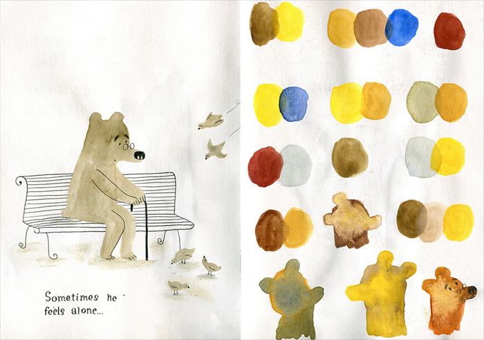
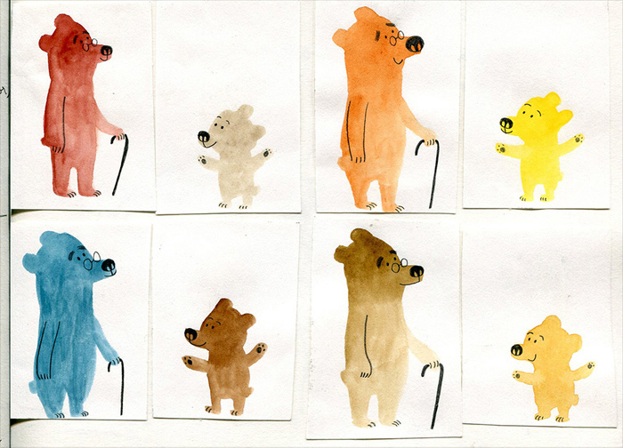
Because the illustrations and the compositions were very clean and simple, I thought that colour would have to be very important. Colour would almost have its own voice. It had to help to communicate the idea of the book, and I wanted it to have a limited palette.
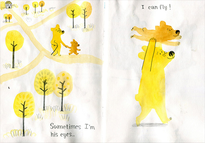
After trying different combinations of colours, I decided to go for pale but warm brown for the grandpa and vibrant orangey-red for the grandson. I thought it was the right combination for the story that I was trying to tell.
After experimenting with screen printing on the MA, I fell in love with the technique. And unconsciously I think I treated the illustrations of this book almost as if I was screen printing them. Even though I used watercolours and pencil.
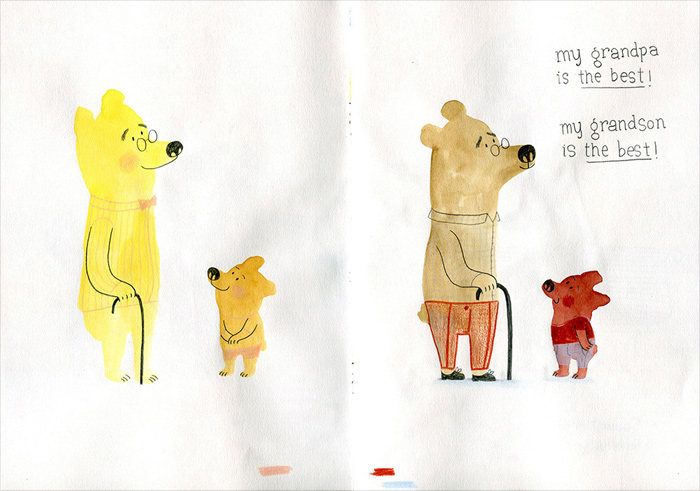
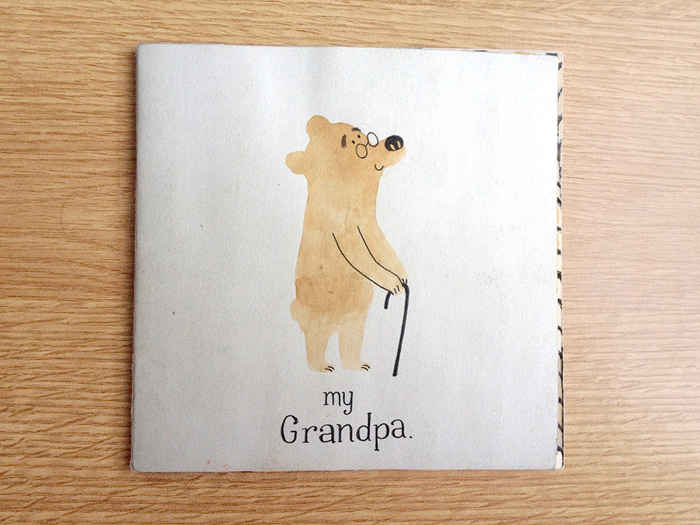
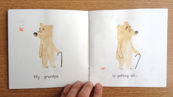
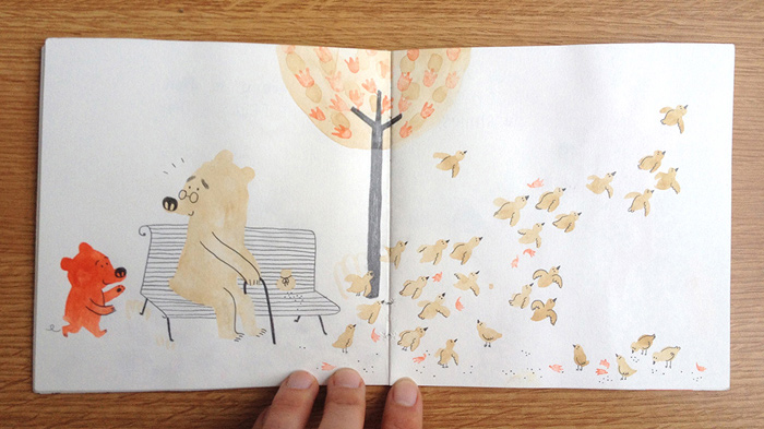
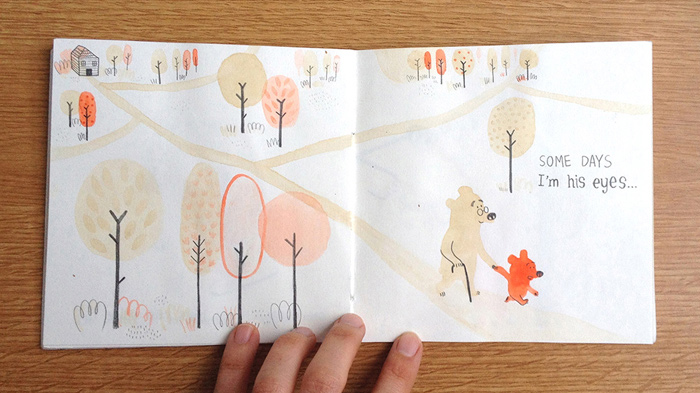
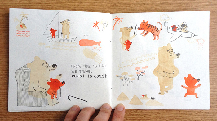
Once the storyboard made sense, I made this little dummy book.
I painted with watercolours straight onto the paper of the dummy book. Both sides, which made it very difficult to scan later on. But I did it, and that was what I presented at the final MA show at Foyles bookshop gallery in London, with my classmates.
It still feels unreal, but after the final MA show I started working with Macmillan Children's Books. They wanted to publish both of my final projects! ‘My Grandpa’ and ‘I am an Artist’!
I got on very well with my editor, Emily Ford, and the art director of this book, Jo Spooner. Working on this project with them was great. We talked a lot! And up until the very last minute, we were tweaking words. It was fun!
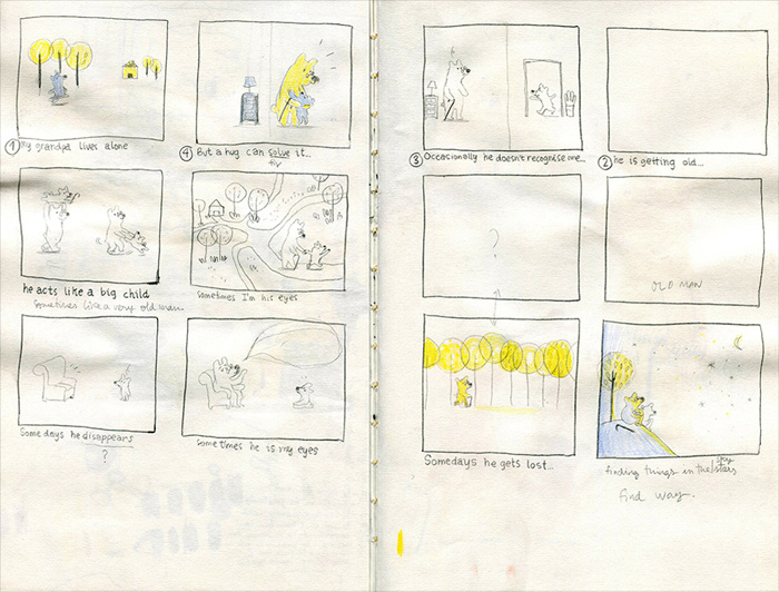
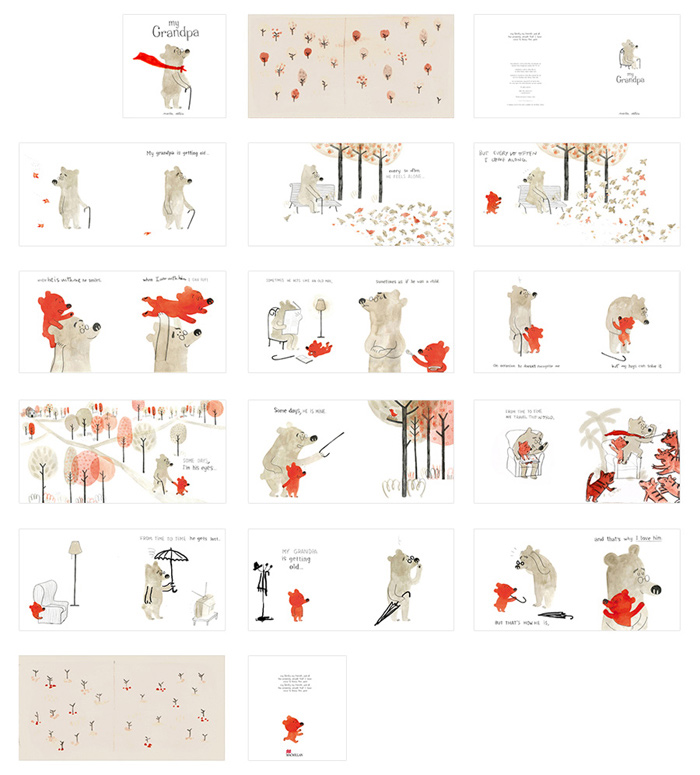
This is the final storyboard that was approved before doing the artwork.
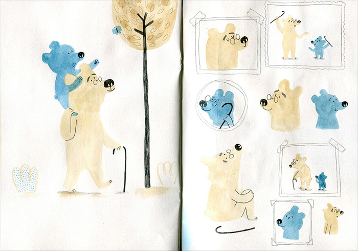
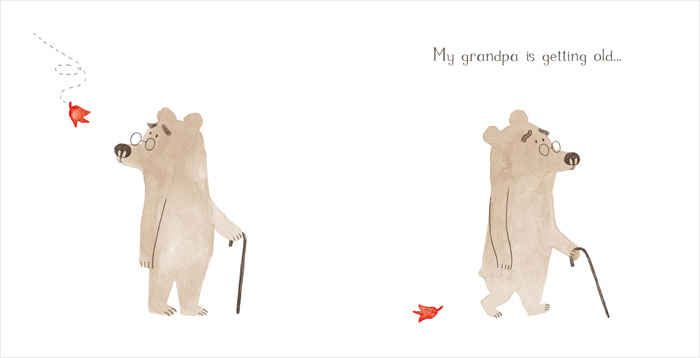
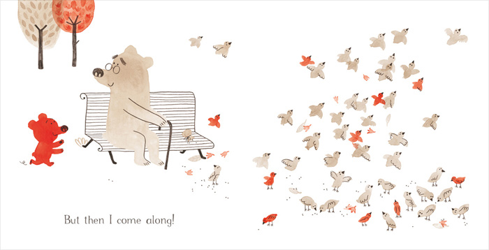
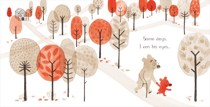
Most of the illustrations remained the same as the ones I had in my dummy book. But I did all the illustrations again to improve the compositions, colours and the consistency of the characters, as much as I could.
I had just started using watercolours on the MA, so I did the illustrations many times to get the ‘shades’ right. And with some of them I used Photoshop to fix them or to make them lighter where I wanted.
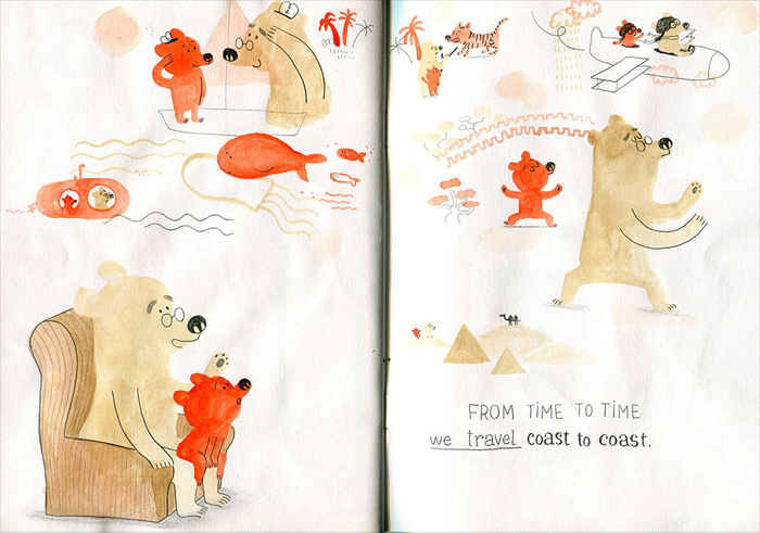
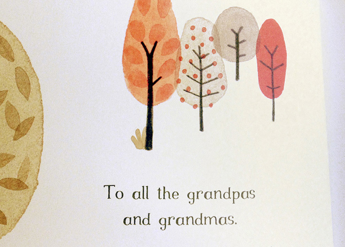
I did some of the images in layers (like screen printing). Red on one layer, brown on another one, and pencil on top. That way I could control the colours better. Or I could move things around – like the trees in this case.
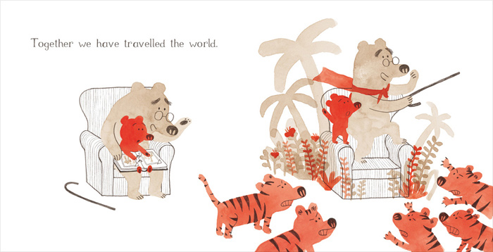
This is one of the pages that changed the most. And I'm very happy about it! I think it's less literal than the one I had. And I really liked the idea of a living room turning into a jungle! My grandpa could do that.
Something that I'm also very happy about in this book, is that the publisher wanted to keep the feeling of the hand lettering I had in the dummy book. So they turned it into a font! A very ‘grandpa’ font, that I think connects very well with the illustrations.
As I said, because there are very few elements in this book, I wanted for all of them to count. Colour, font, endpapers, title page... I really like the idea of a story starting from the cover.
Illustrations © Marta Altés.
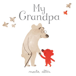
My Grandpa
Marta Altés
Macmillan Children's Books, United Kingdom, 2012
My Grandpa is getting old. But that's how he is, and that's why I love him.
A moving and memorable book about the very special relationship between an elderly grandfather and his adoring grandson, this unique look at old age through the eyes of a young bear is big-hearted, poignant and beautifully observed.
