< Back to posts
Ana Pez
Spain
Ana Pez studied History and Illustration at university in Madrid. Since graduating, she's worked on a wide range of projects including album covers, websites, posters, theatre design, and books. In 2015, Ana received a Special Mention at the Bologna Ragazzi Awards and she was selected for the prestigious Bologna Illustrators Exhibition.
In this post, Ana talks about the creation of ‘Mon petit frère invisible’ (My invisible little brother). This brilliantly inventive picturebook is published in France by L’Agrume, and it received an Opera Prima Special Mention at the 2015 Bologna Ragazzi Awards.
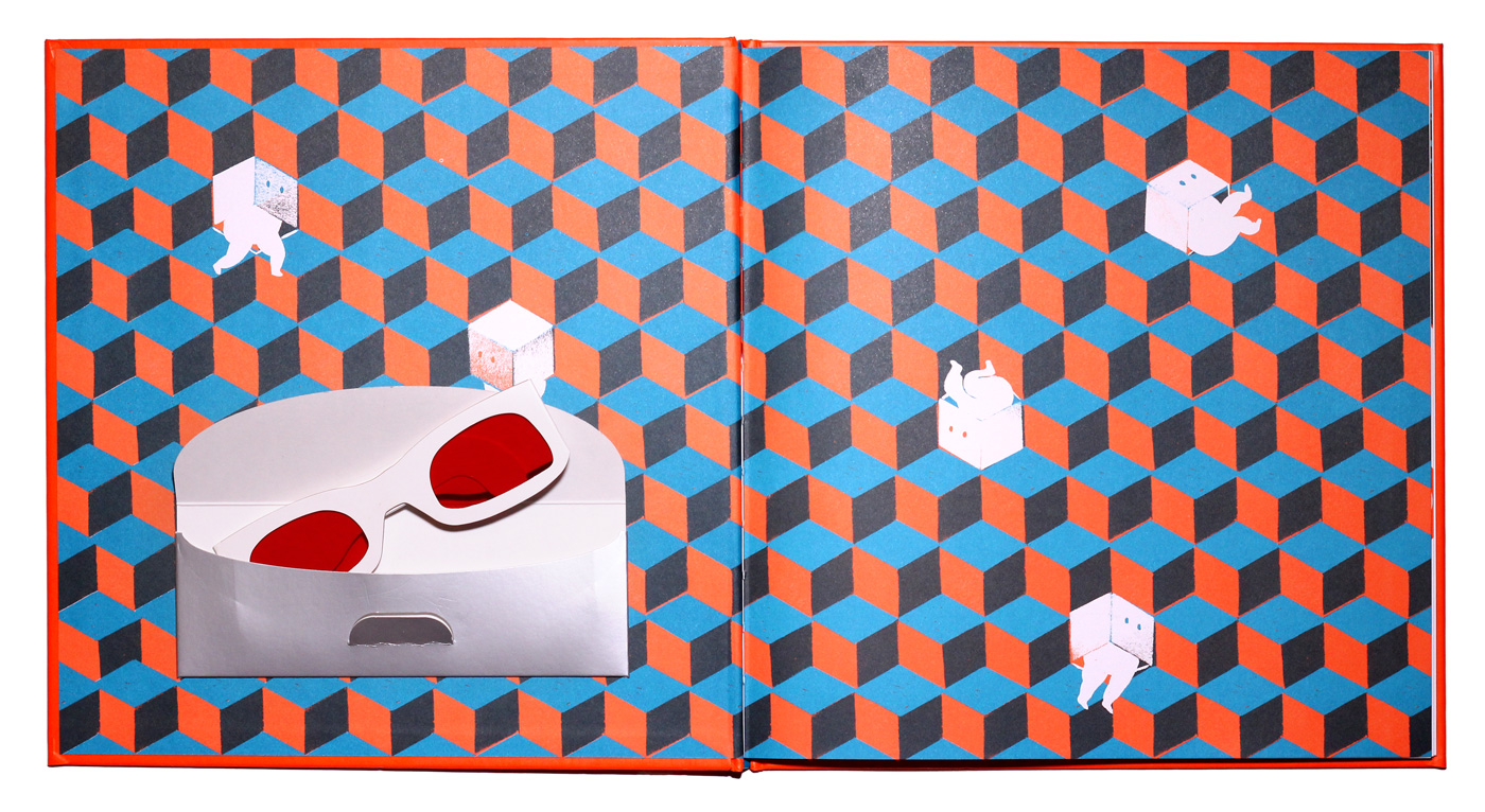
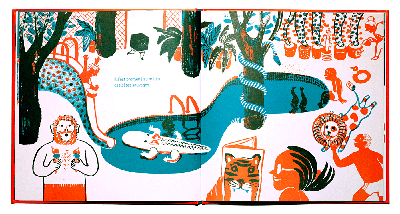
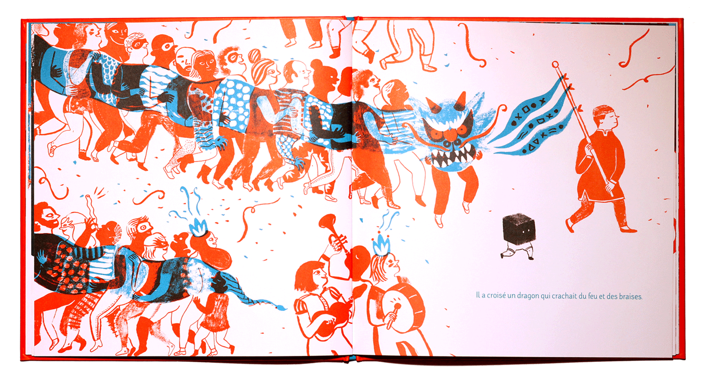
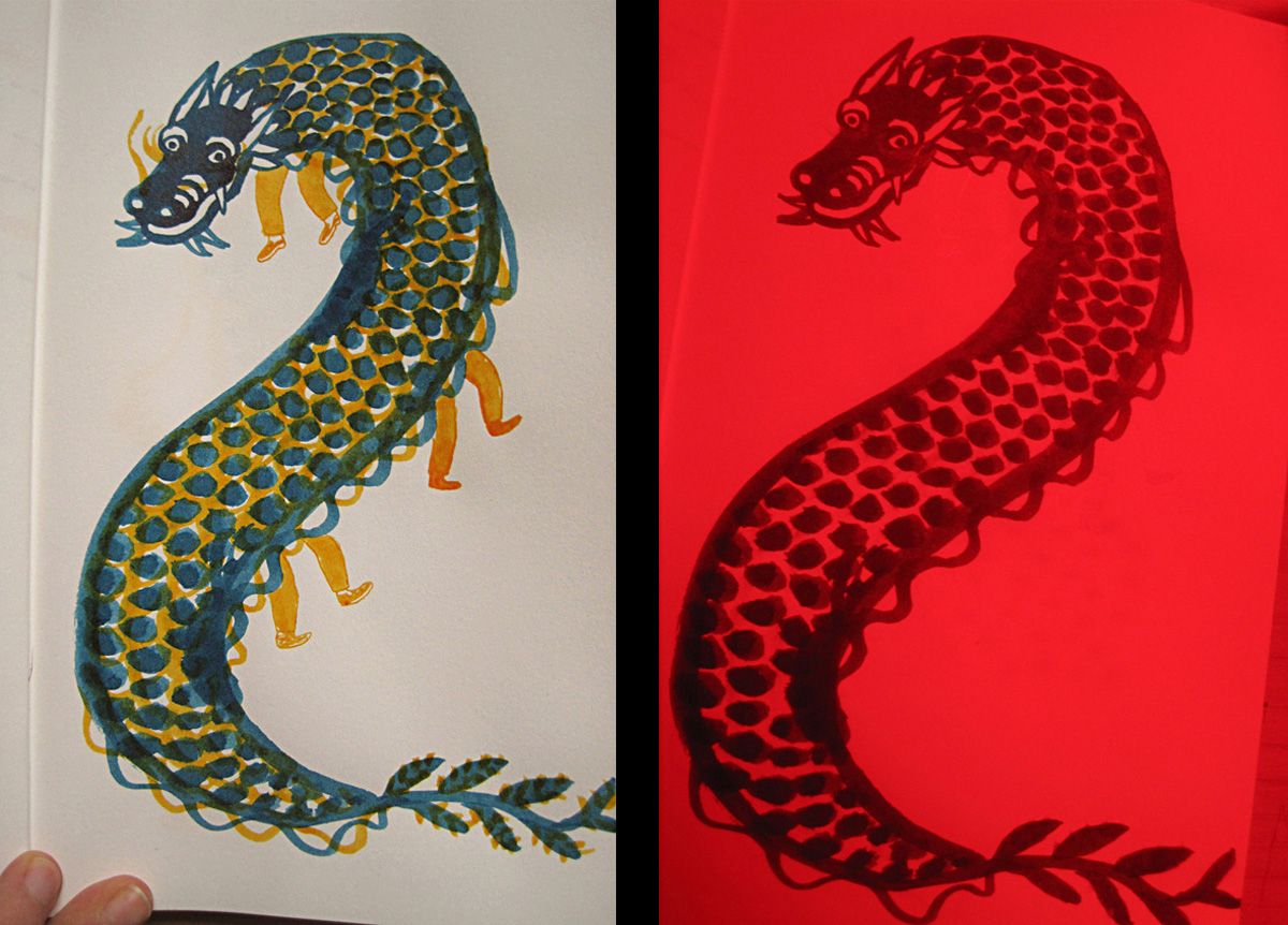
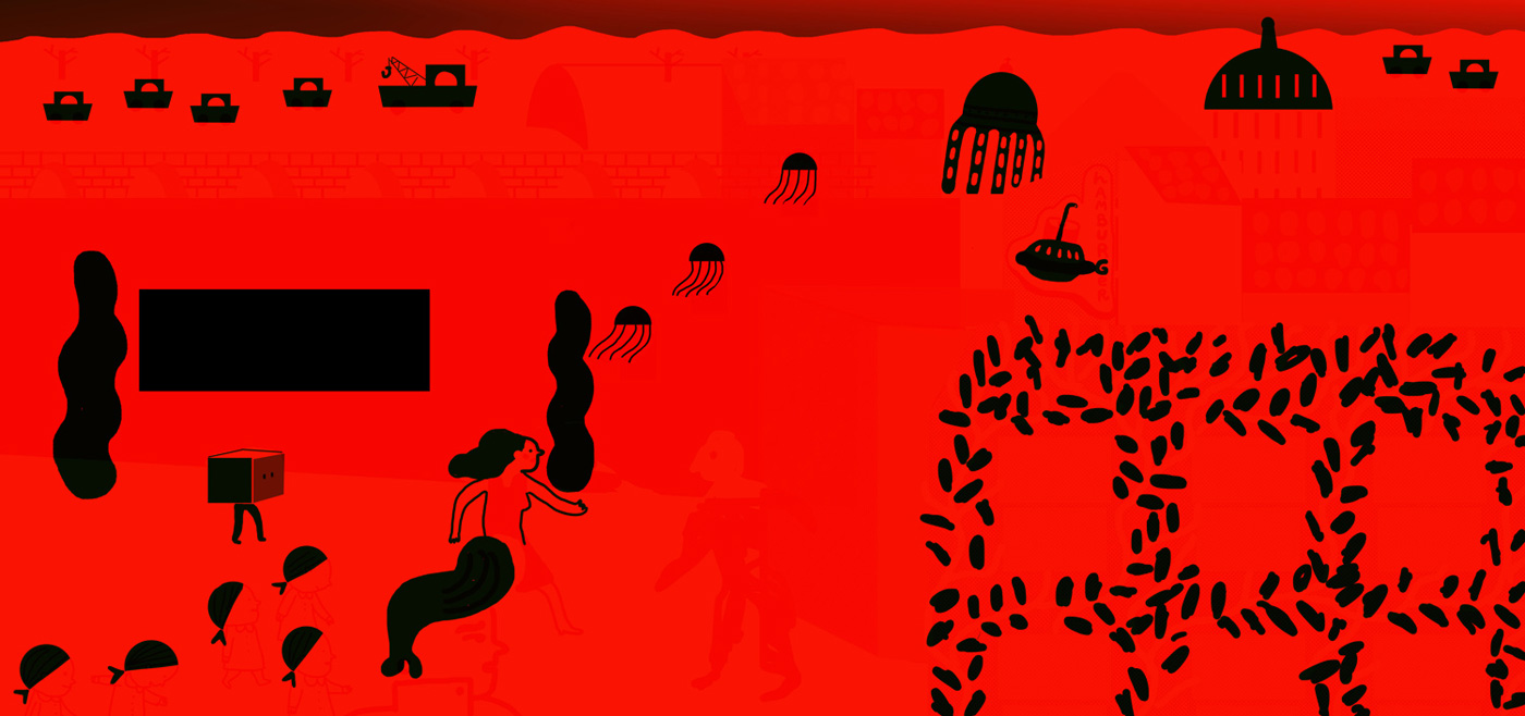
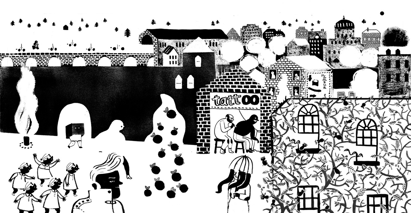
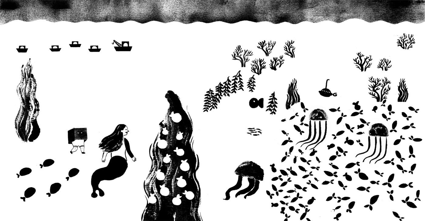
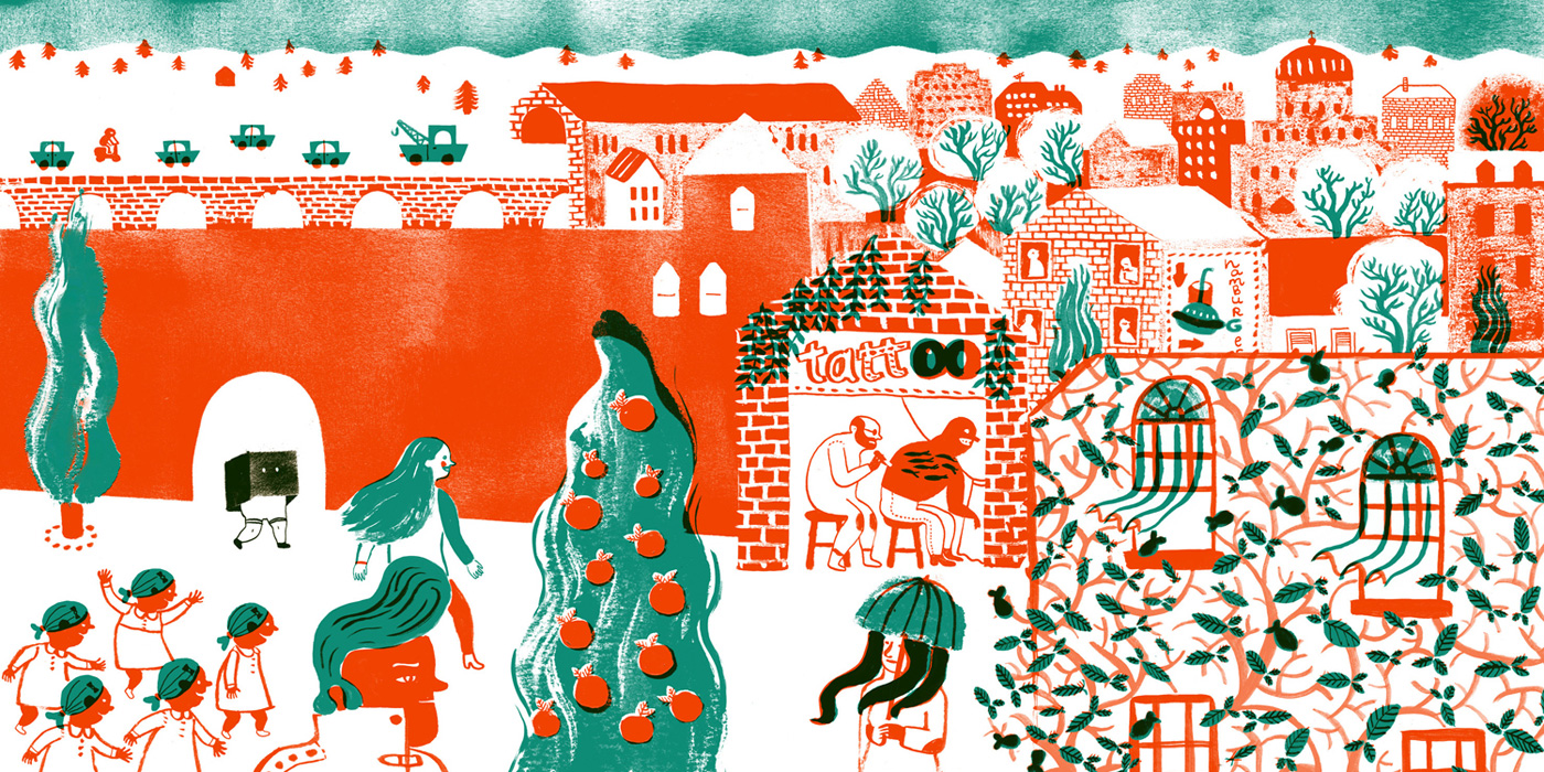
Ana: ‘Mon petit frère invisible’ is two stories: one about an invisible boy who can see invisible things, and another about a boy who believes he is invisible, but isn't. This is achieved by the fact that the book is printed in two inks: orange and greenish-blue, and that it includes red-tinted glasses that makes the orange ink invisible and the illustrations change, showing different things.
The first version of this book was my final project while I was studying Illustration at the Escuela de Arte Diez in Madrid, four years ago. I'd decided to make the kind of picturebook I'd like to find in a bookshop. That summer I discovered Bruno Munari's work, and I was amazed by its freshness. I particularly liked ‘The Circus in the Mist’ because of its surprise factor.
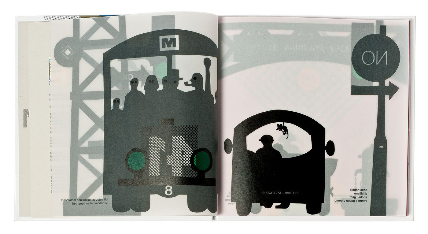
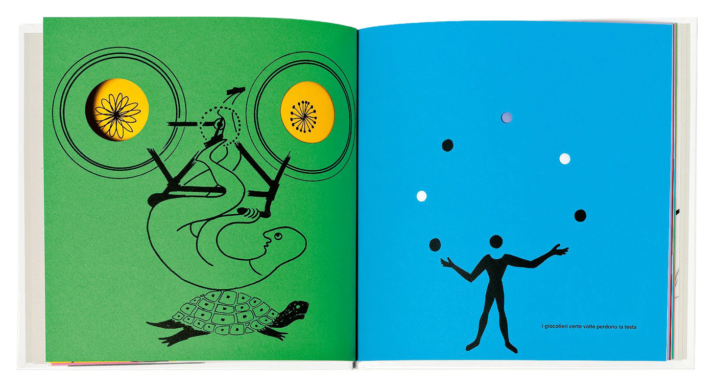
‘Nella Nebbia di Milano’ (The Circus in the Mist) by Bruno Munari, published by Emme Edizioni, 1968.
Like Bruno Munari, I wanted to experiment with the book's format and with how several elements could be used to cause surprise and alter the way the book is read – and so I started researching dies, formats and uncommon papers. This is how I got the idea of using transparent red paper that conceals the red ink.
I thought it would be fun to use the red layer directly with the reader, perhaps through a pair of glasses, so I decided to pursue this path.
Then my idea was to produce a book with two different stories which changed depending on whether you read the book with or without the glasses: so you'd read the book with the glasses on first, and then you'd read it again without them to discover a different story.
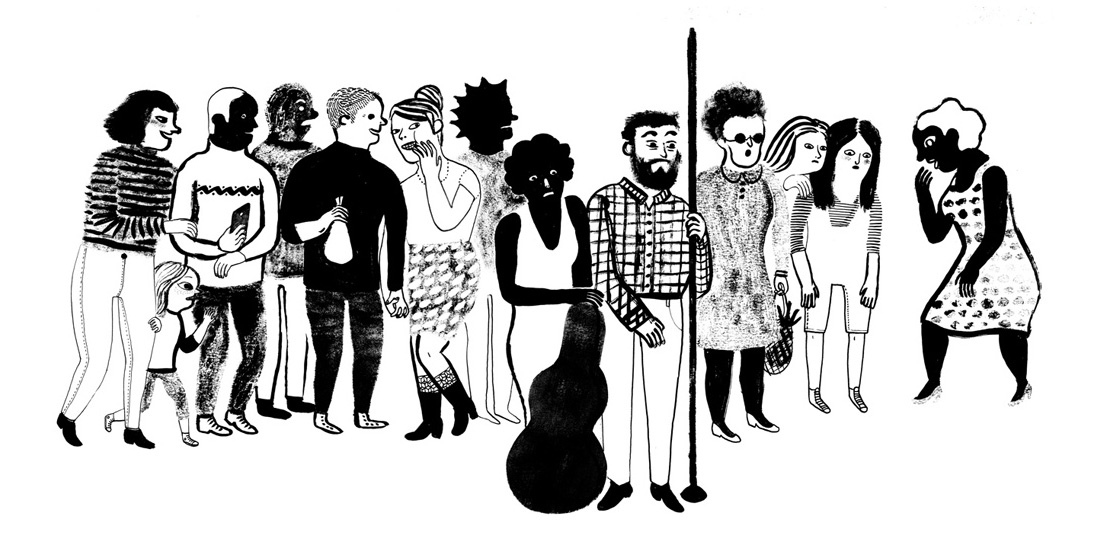
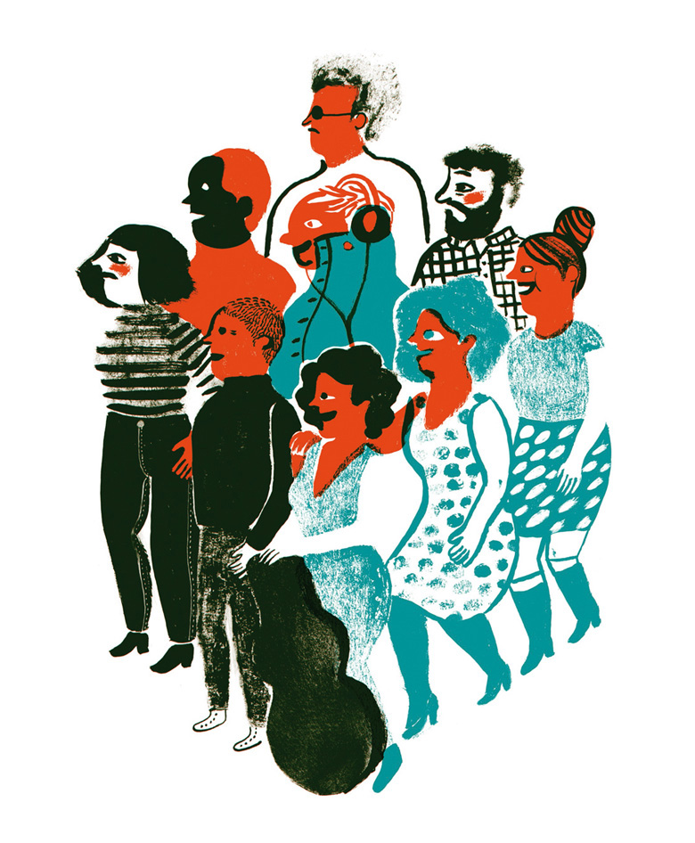
The concept was ‘the invisible’. I thought about small children and about a very popular game adults often play with them: covering their eyes and asking where they are, as if the children had become invisible by not being able to see. This game gave me a foundation on which to build both stories: A boy who covers his eyes and turns invisible; A boy who covers his eyes and believes he's turned invisible, but he actually hasn't. At the same time, I made a little homage to myself. I'm an only daughter, and as a child I wished for a brother, but it wasn't possible. Since I didn't have a brother, I made up an invisible one. That's where the big sister in the book comes from – and she's a counterpoint to the little brother.
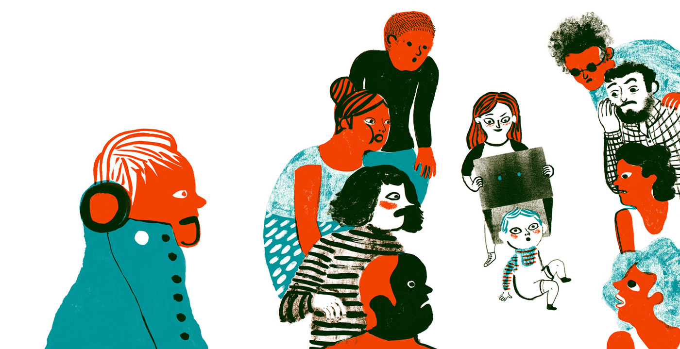
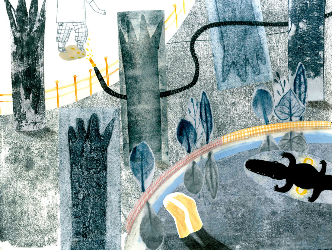
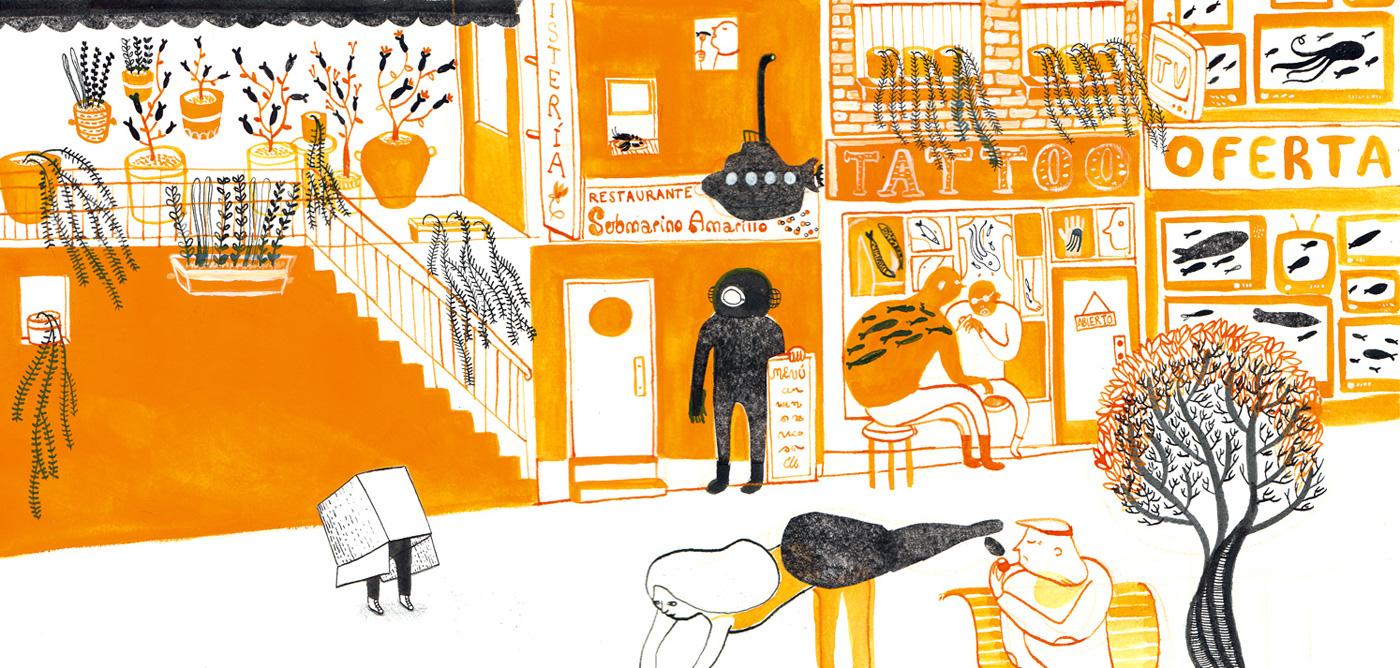
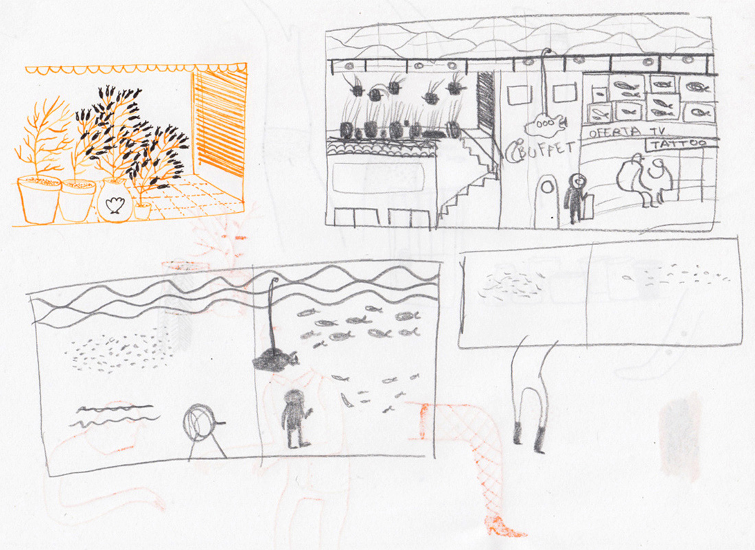
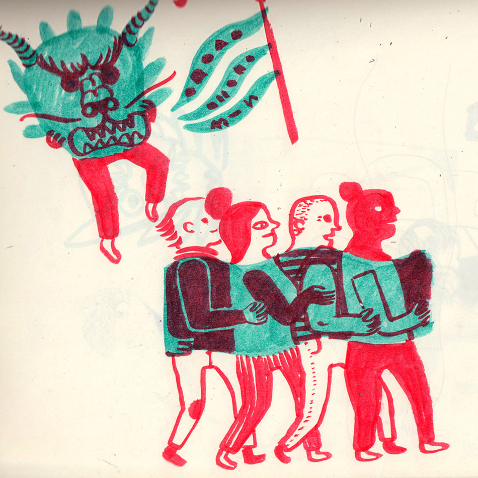
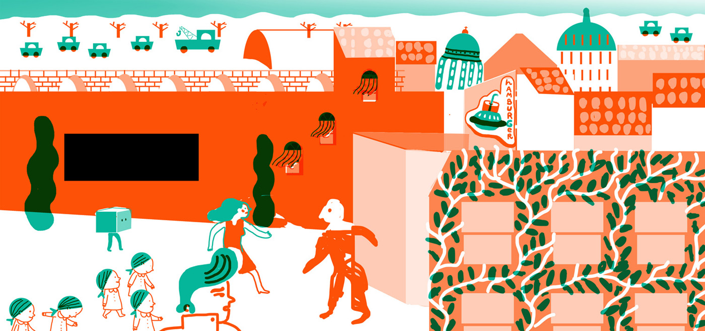
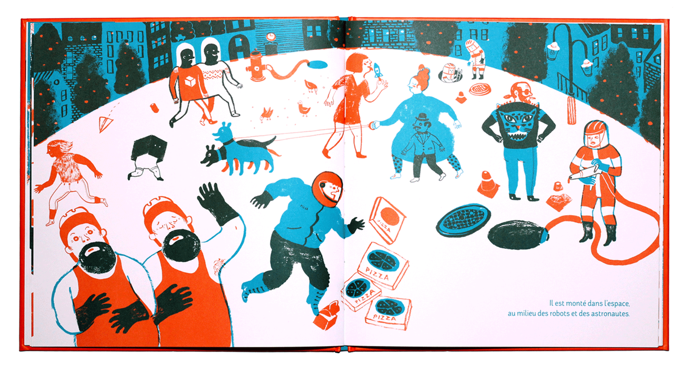
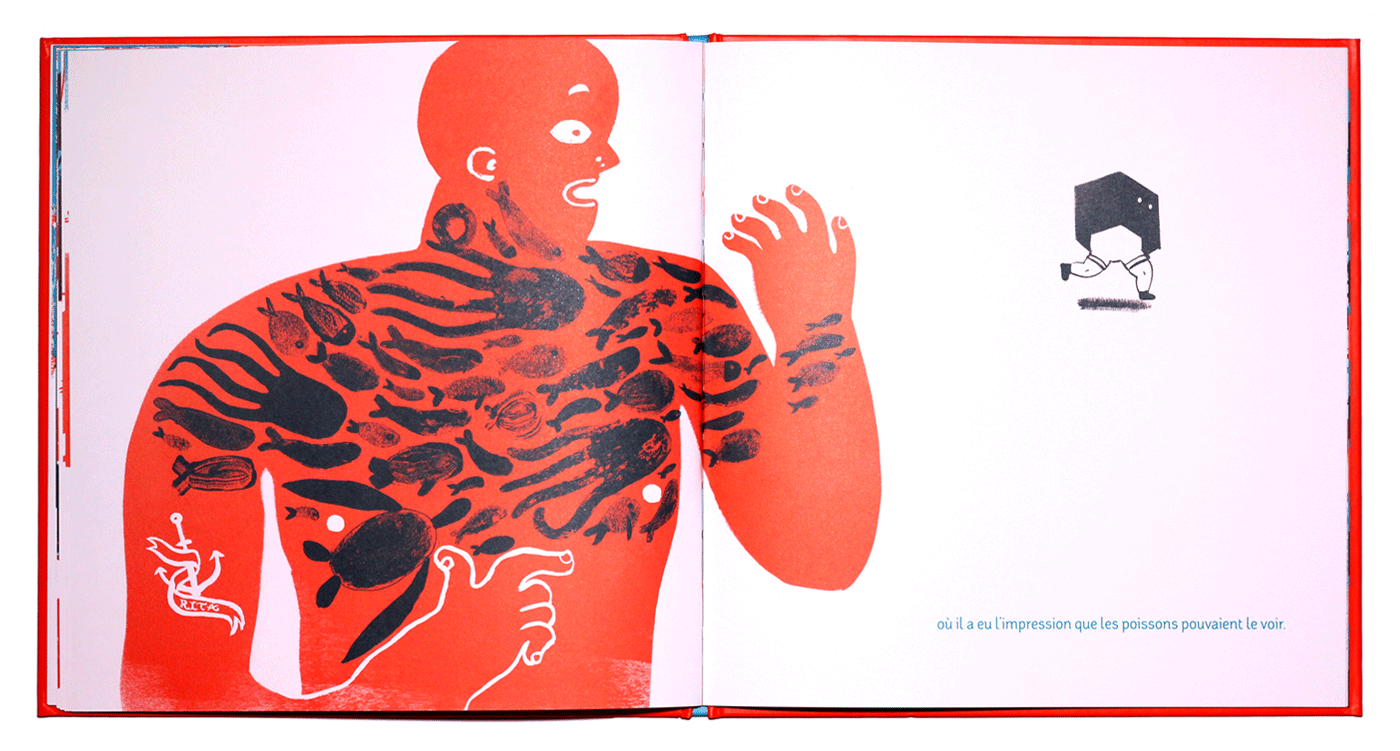
I tried to make the best of the glasses' invisibility effect: When the boy is invisible he sees invisible things during a trip around the city, passing different urban scenes that turn into fantastic scenes. Since the book and image development was going to be complex, the story needed to be simple, albeit not shallow.
The text came to me at practically the same time as the images did. It was an inevitable consequence of each scene.
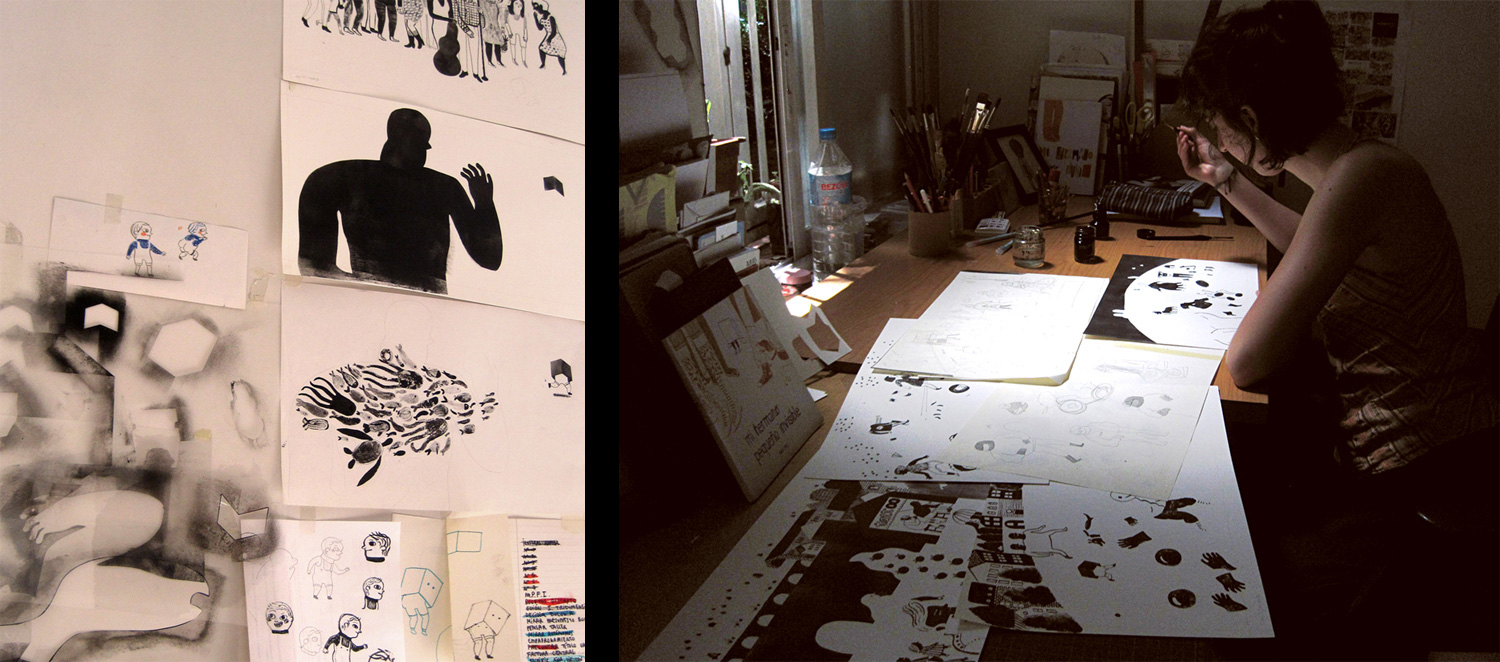
I made a first version of the book, which I presented as a final project at college. That version would've been impossible to carry out. It was entirely handmade, and I didn't concern myself with how to reproduce the colours in print. What I wanted to do at the time was create something beautiful: to make an impression aesthetically and to develop a graphic style.
I started presenting the project to publishing houses as a work-in-progress. Even though I knew it wouldn't work and I still lacked the graphic and narrative knowledge to make it work, I knew that I only had to keep working on it, and with time and experience I would find the key to the solution.
I made the first major adjustments to the second version of the book. I reduced the colours to two inks: orange and black. For the sake of functionality, the style became less elaborate and the story and scenes were better defined.
I also worked harder on the story development and the storyboard. The essence of the first version was still there, but I refined it.
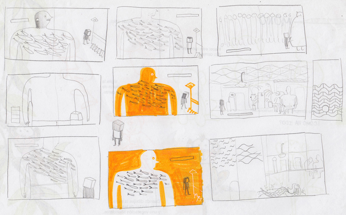
While I was planning the compositions, I drew small scenes that could take place around the main character during the story, letting myself get carried away with each scene, since that also provided me with hints for each illustration.
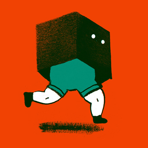
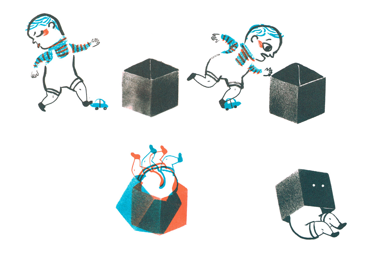
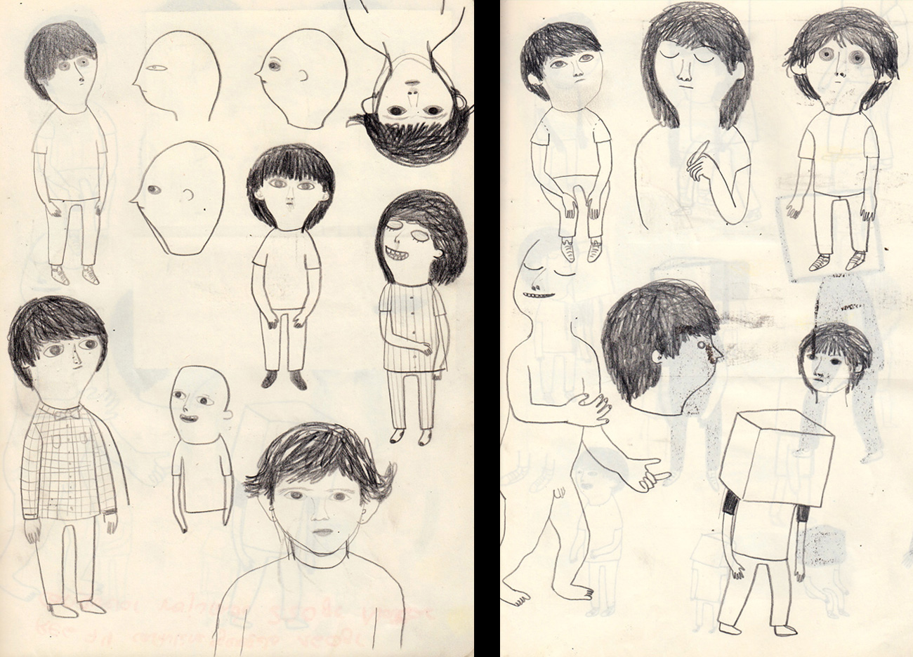
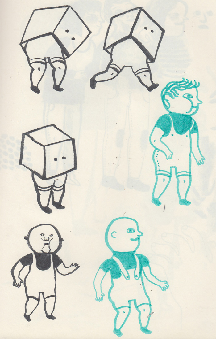
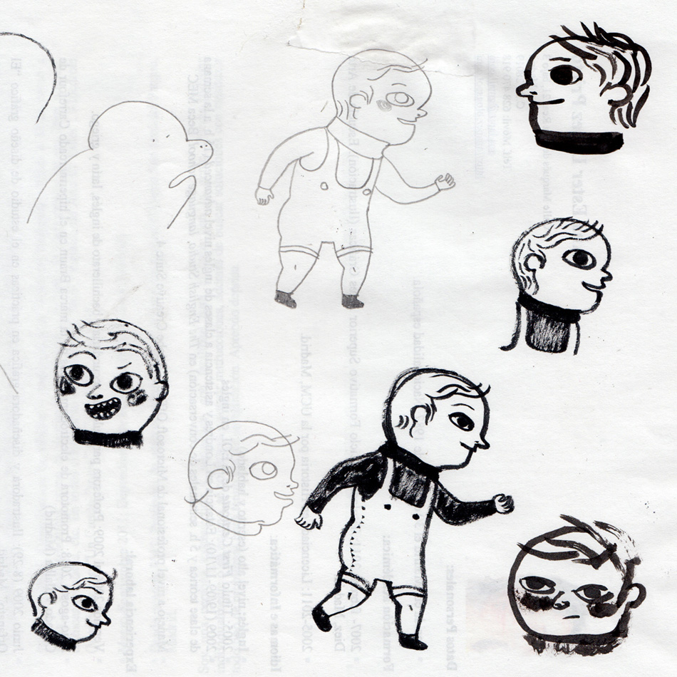
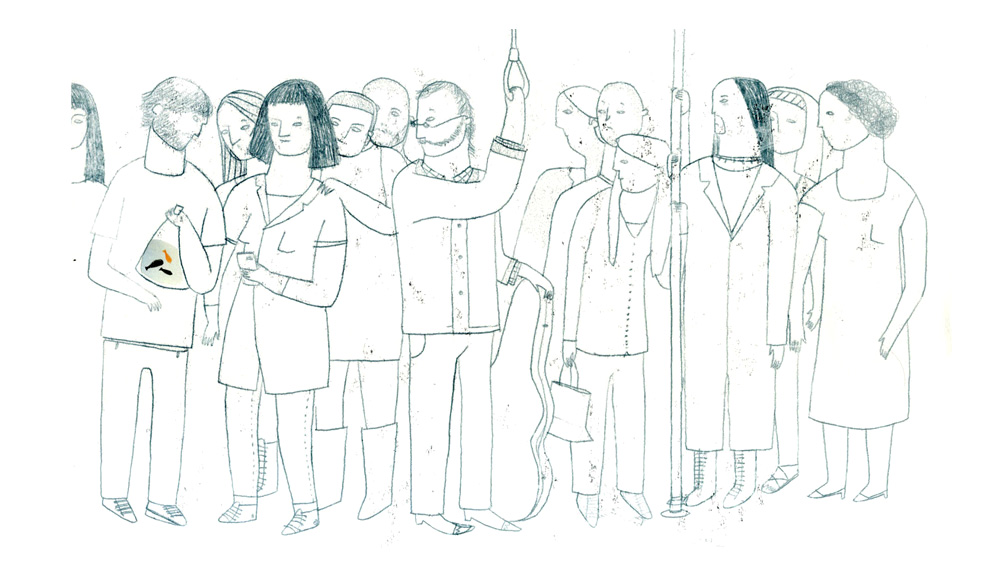
Meanwhile, the characters were changing. I drew many children – with and without boxes on their heads – but I couldn't quite find one that I loved.
I kept working on the book alongside other projects, until a publishing house decided to publish it, and were happy for me to continue refining it. This was the French publishing house, L’Agrume. I worked on the picturebook for another year, during which time I made some very important changes to improve it...
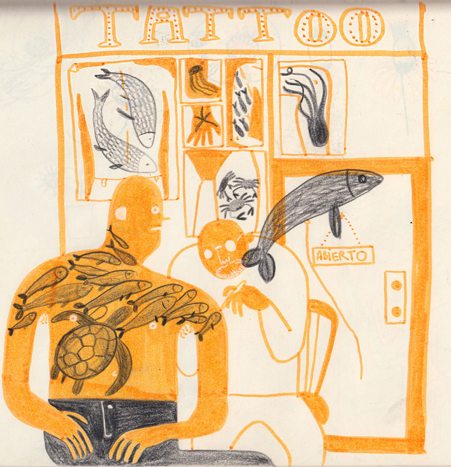
Firstly, I changed the colours once again: to orange and greenish-blue. This allowed me much more freedom to make the visible and invisible images.
Secondly, I finally found a protagonist who I liked. Despite the stroke being fresh, the character is pretty hermetic, like a kind of Mario Bros passing through video game screens.
Thirdly, I switched techniques: I did the illustrations in black and then turned them into colour in Photoshop. This wasn't a stylistic decision; it was about the functionality of the illustrations.
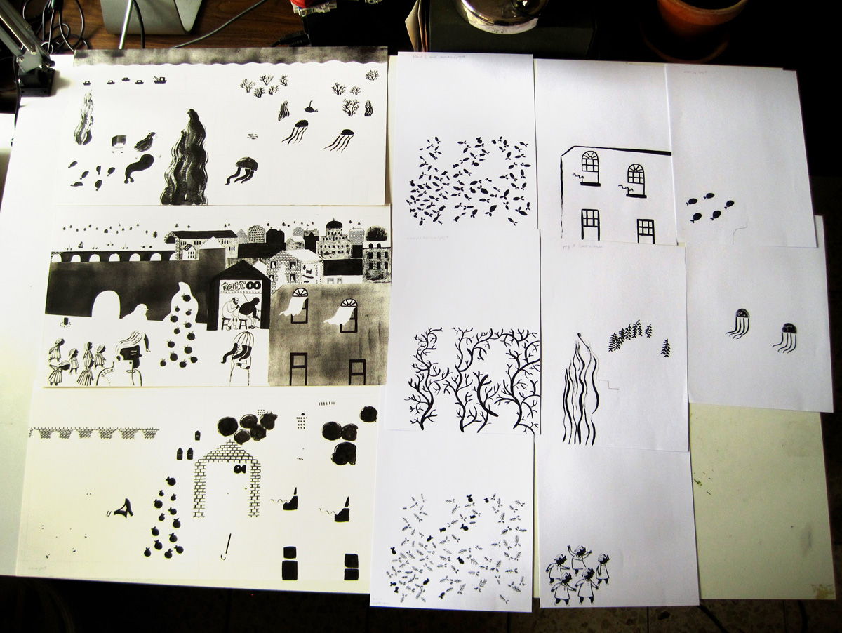
My process was as follows: In a notebook I drew all the ideas I could think of for visible and invisible images, with marker pens and Chinese ink pens. This gave me a selection of ideas I could use later to make the illustrations.
I redid the four most complex images in the book several times, both hand-drawn and digitally, in which most changing elements were mixed together. In Photoshop, I added blocks of colour that showed me where each part went, which allowed me to change each element's size and position to improve the composition and see how the full images worked with and without glasses.
Once I'd decided on the composition, I made the illustrations in Chinese black ink, sometimes using acetate templates to apply black acrylic. I made a black layer on paper for each colour, as if it was going to be screen-printed.
There were at least three layers or drawings per illustration: one for orange, one for blue and one for the resulting colour of mixing both tones. However, some illustrations required more layers, like the ones which have details in white. Some illustrations ended up consisting of over ten sheets. As you can imagine, scanning it was a bit of a mess.
Then I assembled everything in Photoshop, leaving only two layers which would be turned into orange and blue.
Once coloured on the computer, the result was the final illustration.
Using Chinese ink as a technique allowed me to produce a much fresher graphic style with looser lines, and play with the ambiguity of the shapes, which was necessary to make the images work with and without glasses, changing from one thing to another.
The process of making the final illustrations took about two months, and during that time I worked exclusively on this project. To create a good environment, I flooded my desk with sketches, older versions of the spreads, reference material, and finished illustrations.
Besides being my first book as an author, ‘Mon petit frère invisible’ is my leap from being a trainee illustrator to becoming a professional illustrator. It's fun for me to see how the project and my drawing style have evolved from the first version, which was college work, to the final version, which is a mature and professional project.
The difficulty in creating the images resided in building illustrations that depicted a scene without glasses, but contained another scene – the invisible one – concealed. And both scenes had to work well to build a story; they had to be completely integrated into the narrative. I know that the idea of the glasses could have just stayed as a game to find what's hidden and what's revealed – but that was of no interest to me. I wanted to use the game as part of the narrative. So the images had to have beautiful compositions in both their visible and invisible modes.
Also, the invisible world had to be totally separate from the visible one – as hidden as possible – so the surprise would occur when seeing the contrast between the two. It had to be like a magic trick: The trick is actually easy if explained, but it should be spectacular and unexpected.
Illustrations © Ana Pez. Post translated by Gengo and edited by dPICTUS.
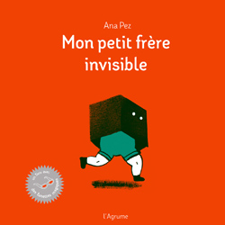
Mon petit frère invisible /
My invisible little brother
Ana Pez, L’Agrume, France, 2014
‘At first read, this is simply a story of a girl and her younger brother, but with a clever use of coloured glasses, a second story and alternate point of view are revealed. As the boy moves ‘invisibly’ through the narrative, the shift in perspective throughout ‘Mon petit frère invisible’ sheds light on the child’s place as he moves through the adult world.’
—2015 Bologna Ragazzi Awards Jury