< Back to posts
Chris Haughton
United Kingdom
Chris Haughton's first picturebook, ‘A Bit Lost’ has been translated into over twenty languages and has won many international awards, including the Premio Andersen Award. Chris co-founded the fair trade social business, NODE, and he was listed in Time Magazine's ‘Design 100’ for his work with the fair trade company, People Tree.
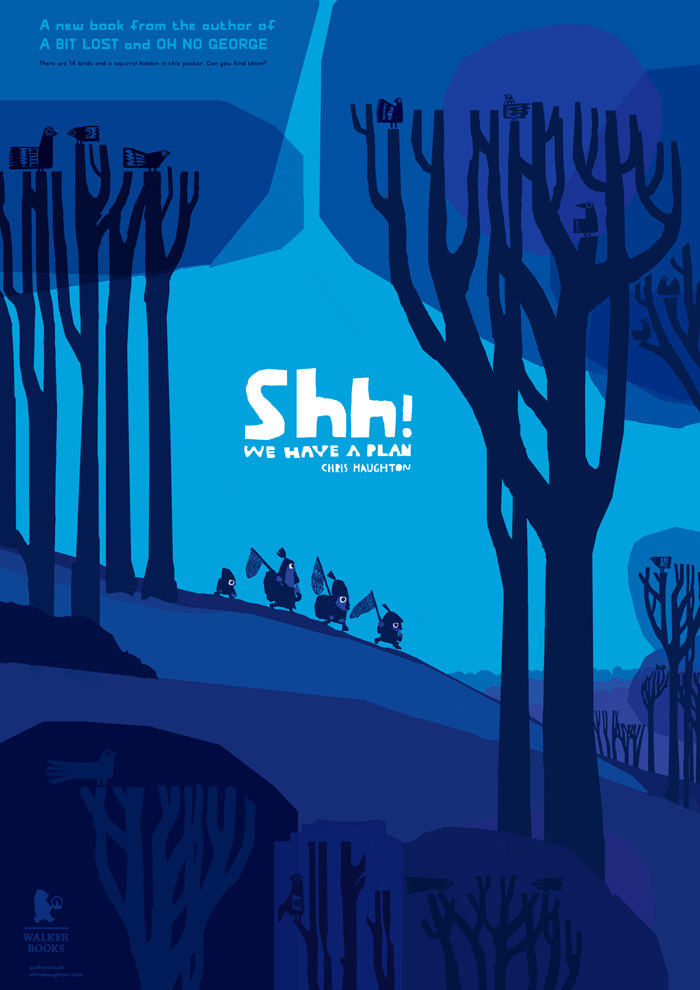
In this post, Chris talks about the creation of his bold new picturebook with Walker Books, ‘Shh! We have a plan’. The book has been translated into numerous languages including Italian, Spanish, French, German, Portuguese, Dutch, Swedish and Japanese.
Chris: As an illustrator, it's been drilled into me that I need to simplify everything to communicate something very elemental – so I try to find the very essence of a story and strip everything else back. One of the things I've been trying with my books is to tell stories as much as possible through images rather than through words. If the story can be read without language, it should have the ability to be understood by the very young.
I'd like to think all my books are told in a way that someone without language could understand, but I think this book could be the most visual of the three. It certainly has the least text. In fact, the total word count is a hundred and three, and ten of those words are ‘shh’, which I'm not sure is a word, but I counted it anyway.
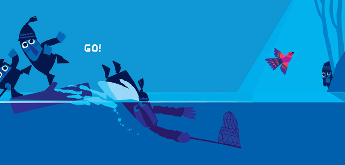
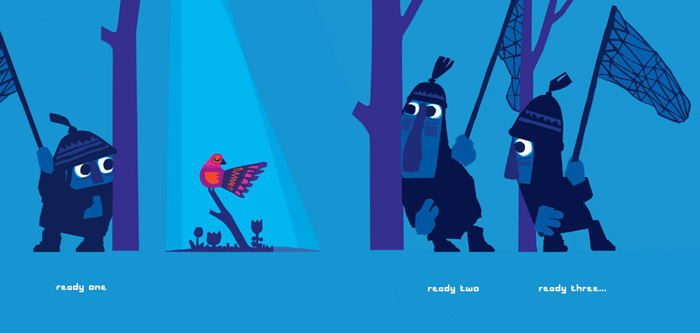
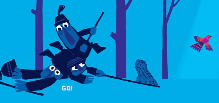
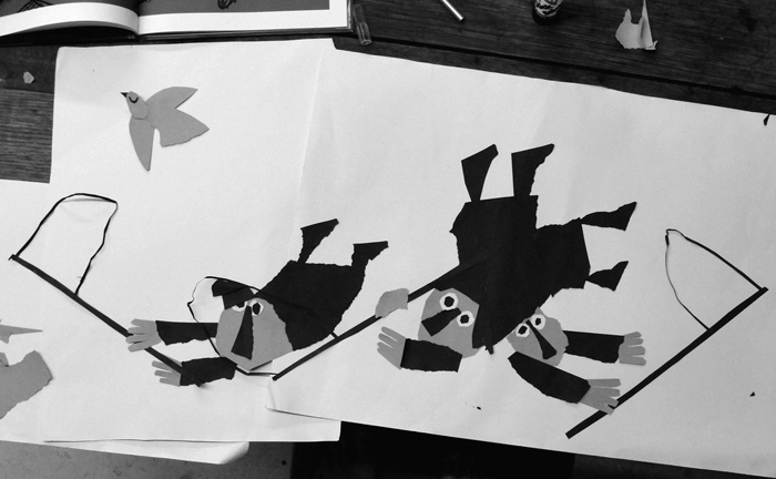
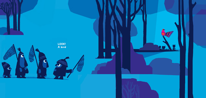
I started sketching out ideas thinking there must be some way of making a chase/catch type book. It was sparked by seeing an incredibly inspiring show at the Edinburgh Fringe by Mr. Bunk called Swamp Juice. It brought me around to thinking of the Road Runner cartoons where there are elaborate plans which could work well visually. Quite suddenly, three goon-type characters trying to trap a bird popped into my head – and I thought it would be great if they each had a different plan. What I liked the best was there could be a drawn-out pantomime effect (similar to ‘A Bit Lost’ and ‘Oh No, George!’) with an anticipatory page-turn between ‘ready, steady’ – where the three position themselves to catch the bird – and ‘GO!’... where of course, they miss.
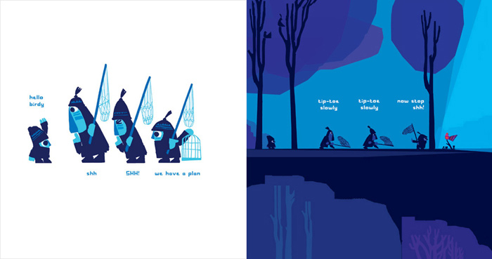
Finding the ending was easy as I had sort of come up with it in the beginning! The really tricky part was fitting it into the story. I originally had three other ‘good’ characters who were feeding the birds – but it seemed abrupt to introduce them midway. It seemed best to have a character with the answer the whole way through. The book seemed a little clunky and wordy when mocked up with four or five characters on every page, so together with my art director, Deirdre, we hit on the idea of a conversation happening across the page. There was lots of comic potential with this. It makes use of repetition, where each character repeats the same thing, over and over again. It's predictable, but it also has a pantomime effect and is great for doing silly voices.
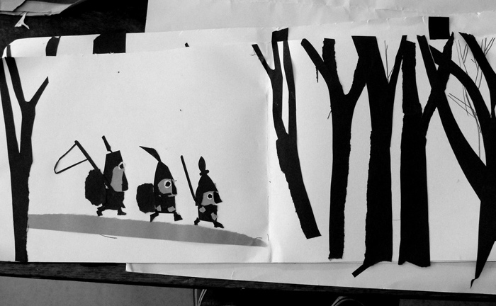
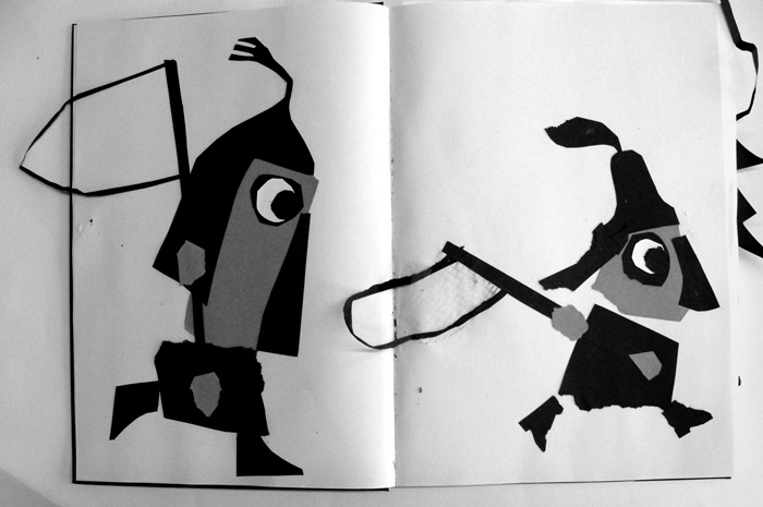
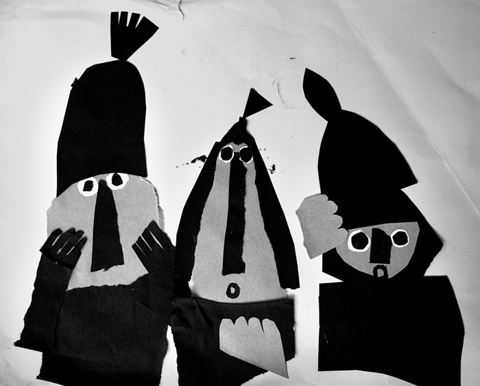
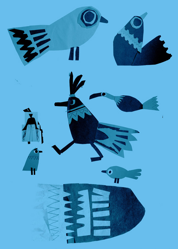
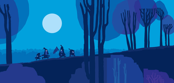
For my other two books, I'm always asked if I used paper cut, as they look quite like it – but in fact I didn't use paper cut at all when creating the artwork. It was all pencil and digital. For this book though, because it had five characters on each page, it needed some sort of drastic simplification for it to be read clearly. Not only that, but I was keen for the conversations to read across the page, matching each line with the action of the character. There was so much shifting of compositions around on the pages that it became clear the best way to compose each page was by collage. In fact, it made perfect sense to create a mainly silhouette image from paper cut – and the design of the birds benefitted from it too.
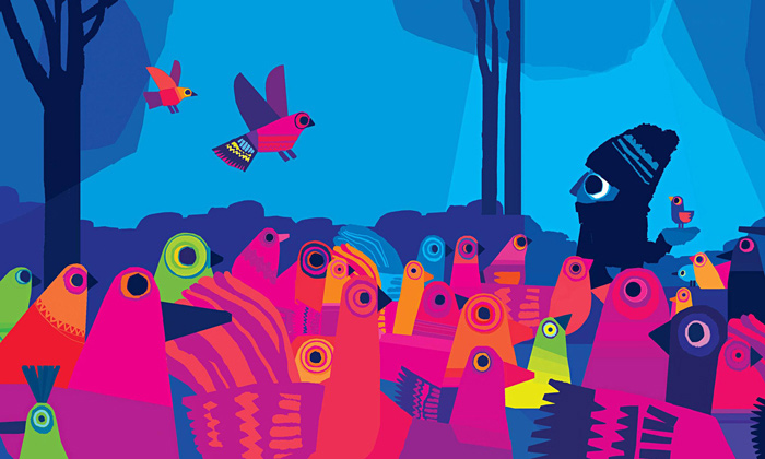
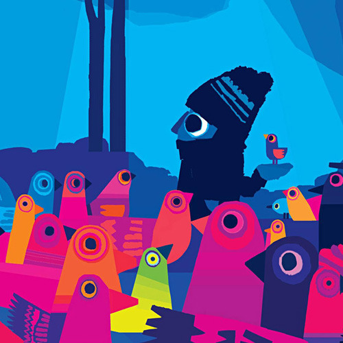
For the final artwork I was keen that that the bird seemed somehow from another world – brightly coloured and abstracted and removed from the world of the characters. It focuses all our attention on the relatively tiny bird on the page, leads the reader through the pages of the book, and gives a punch of colour at the end. My other books are very colourful, so it was quite satisfying to try to work almost entirely in silhouette for this one. In fact, there were a lot of really interesting experiments with the colour. Usually full colour printing is in CMYK, but the whole of this book is printed in only CMK (blue, magenta and black), and the only yellow that appears in the book is in the colour of the birds. It was our hope that with this approach the bird would stand out completely from the rest of the book.
Illustrations and photographs © Chris Haughton. Trailer animated by Animade – Sound/music by Matt Wand.
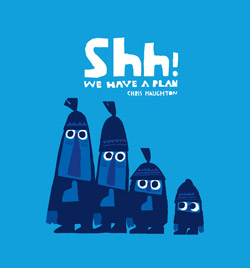
Shh! We have a plan
Chris Haughton
Walker Books, United Kingdom, 2014
‘From one of the most exciting new voices in children's literature comes a new picturebook about a beautiful bird, an unquenchable desire, and plans gone awry.’
—The Guardian
‘Chris Haughton scored critical hits with his first two books and is back with a third – brimming with the same offbeat humour and distinctive, bold artwork.’
—The Bookseller
- English: Walker Books
- French: Editions Thierry Magnier
- German: S. Fischer Verlage
- Italian: Lapis
- Norwegian: Fortellerforl.
- Danish: Jensen & Dalgaard
- Dutch: Gottmer
- Portuguese (Brazil): Editora Rovelle
- Spanish: Milrazones
- Catalan: Milrazones
- Swedish: Lilla Piratförlaget
- Japanese: BL出版
- Chinese (Traditional): Grimm Press
