< Back to posts
Carson Ellis
United States
Carson Ellis is an award-winning illustrator of several children's books, including the New York Times Bestsellers, ‘Wildwood’, written by Colin Meloy, and ‘The Composer is Dead’, written by Lemony Snicket. Carson is also well known for her artwork for bands and musicians which include The Decemberists, Laura Veirs and Weezer.
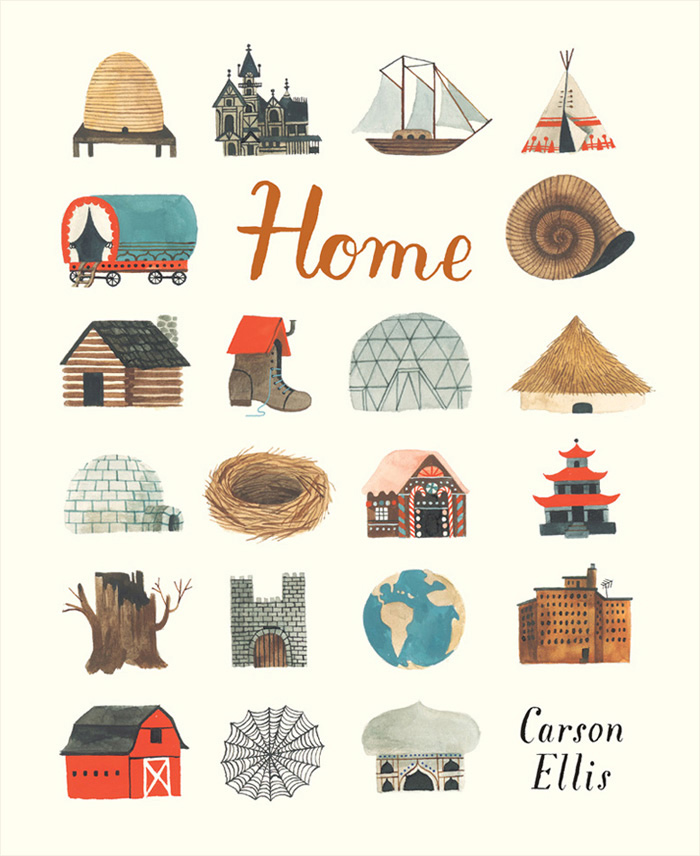
In this post, Carson talks about the creation of her debut picturebook, ‘Home’, and she shares some stunning development work and final illustrations. Published by Candlewick Press in the United States, this unique picturebook is an exploration of the concept of home.
Carson: ‘Home’ is the first picture book I've written. I've been illustrating books for nearly a decade and have worked on some projects that have meant a lot to me (namely the ‘Wildwood Chronicles’, a series of novels I collaborated on with my husband, Colin Meloy), but nothing's been so thrilling as publishing something I wrote myself.
What took me so long? Man, I don't know. I love picture books. I've been collecting them, poring over them, nerding out about them since I was a teenager and every year that I got older I guess it got harder to imagine contributing something worthwhile to an already massive heap of brilliant books. I've had ideas over the years but none of them seemed good enough to bother. At some point I had a little notebook with story ideas in it and at some other point I threw it in the garbage.
But a few years ago I was looking at ‘People’ by Blexbolex and thinking about how good it is. I thought, “You know what's good about this book? The guy who made it didn't spend ages trying to come up with the right story. Instead he started drawing what he loves to draw and just let a narrative unfold.” I actually don't know if that is how Blexbolex made ‘People’ but that's how it felt to me. And that's how a lot of books I love feel to me – books by Richard Scarry and Tomi Ungerer, for example – they feel like the person who made them was in a kind of crazy drawing ecstasy that trumped every other aspect of the book's creation. So I decided to let go of the idea of telling a good story and to start with something I love to draw: homes.
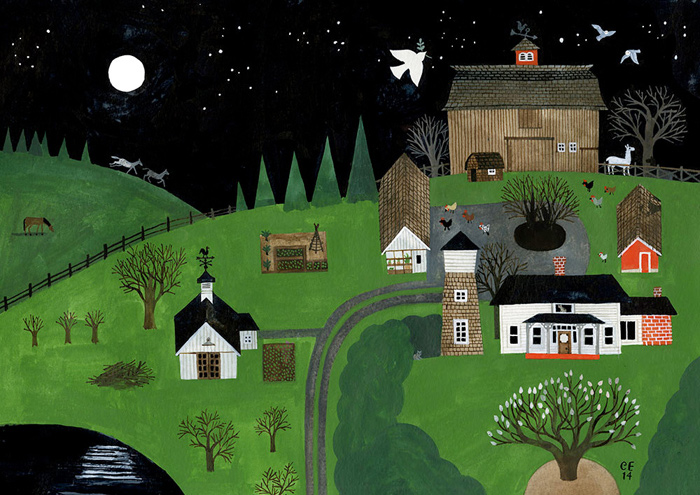
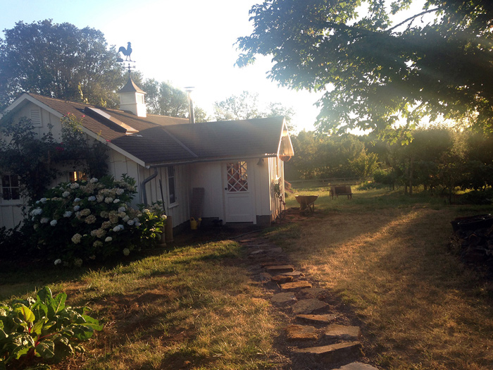
A painting of Carson's farmstead in Oregon, where she lives with her family. Carson's studio is on the left.
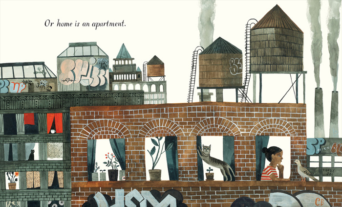
I love to draw homes because I love architecture. I love drawing buildings and all their angles and shingles and nailheads. I also love to draw homes because they naturally suggest narratives about the people (or what-have-you) who inhabit them. And I love to draw them because our own homes mean so much to us.
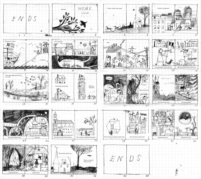
So with this in mind I wrote the manuscript for ‘Home’. It was very simple. I showed it to a handful of trusted friends, including my supportive but always very honest agent, Steve Malk, who liked it. So I sketched out the book in little thumbnails. It looked like this:
This mockup is miraculously close to the final design for the book. Though I counted the pages wrong. I always do. It's a 40 page book.
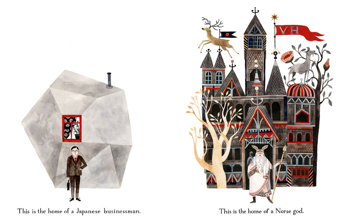
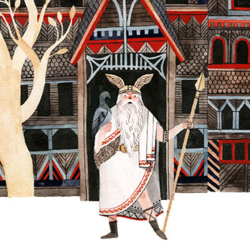
Steve suggested I do a couple of colour pieces to help give potential publishers a better idea of what ‘Home’ might look like, so I made these two paintings, which together form a spread in the book:
I liked the idea that someone as seemingly staid as a Japanese businessman might live in a house this strange and wonderful. And I liked the idea that a real Japanese businessman's house might be, in its way, as fantastic as imaginary Odin's house, Valhalla. This juxtaposition felt like it captured the soul of ‘Home’ to me, so I chose this spread to try to sell publishers on it. It actually turned out to be the most confounding moment in the book to pretty much every editor who looked at it.
But no matter: the book did find its way to a great publisher, Candlewick, and into the capable hands of editor, Liz Bicknell, and art director, Kristen Nobles, who kept this confounding spread in. I got working on sketches for the book about halfway through my pregnancy with my younger son, Milo. I told Liz and Kristen that, for efficiency's sake, I would do really fast, loose sketches. I was pregnant and working on the third Wildwood book at the time and just wanted to quickly flesh those thumbnails out into something more detailed before I had a baby and all hell broke loose. But once I started sketching I felt mysteriously compelled to do the opposite: to labour over each sketch. I spent eons on the sketches for ‘Home’. I sketched forever and ever.
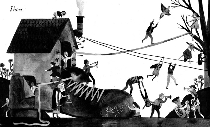
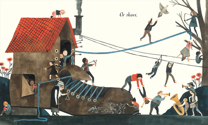
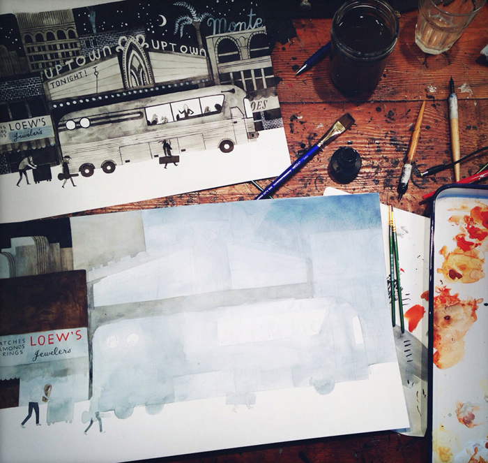
Both the sketches and the final art were done with gouache and ink on watercolour paper. The text in the book is all hand-lettered. Together with Candlewick I created a font for foreign editions that looks pretty comparable.
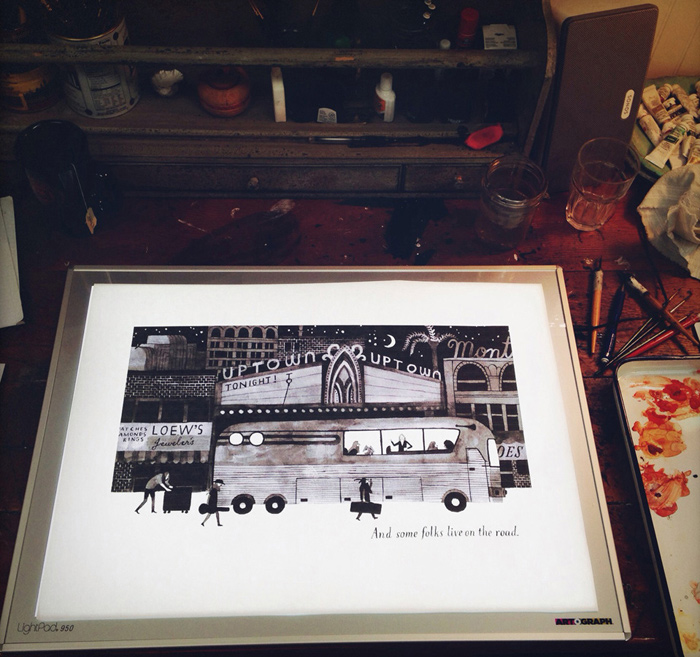
A few years ago my cartoonist/illustrator friend, Laura Park, was visiting my studio and was horrified to discover that I didn't have a light board or really know what one was. I told her how I had been translating my sketches into final art: by printing them out on card stock, cutting around the outline of the image with scissors, and then tracing the cut-out onto watercolour paper to help guide my sketch for the final art. You're probably having a hard time envisioning this; it's that backwards and inefficient. But I went to a state school in the 90s without any illustration or digital arts classes and am a luddite to boot. You should see how I do colour separation in Photoshop. When I explained the method to a designer friend she called me “Amish.” The good news is that Laura insisted I buy a light board right away and I did. I used it to trace my sketches for ‘Home’ and it totally revolutionised my whole deal.
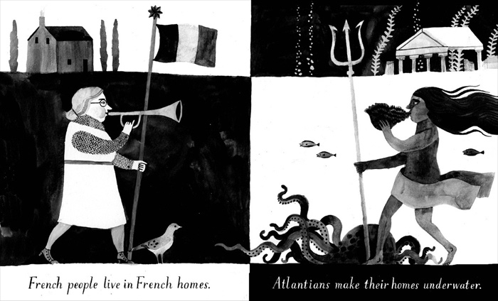
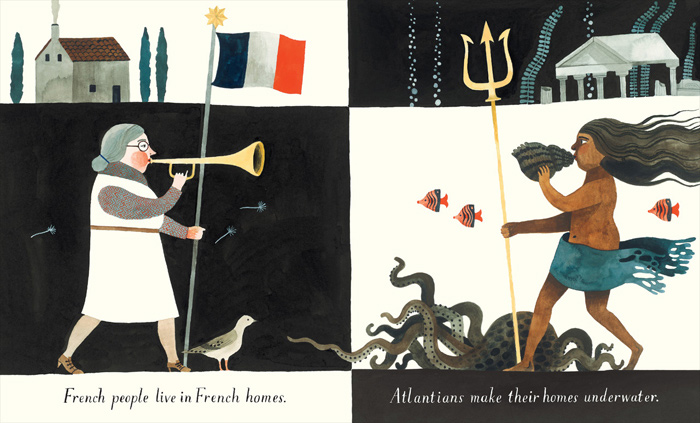
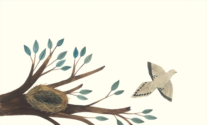
This mourning dove is somewhere on every spread of the book, sometimes pretty hidden.
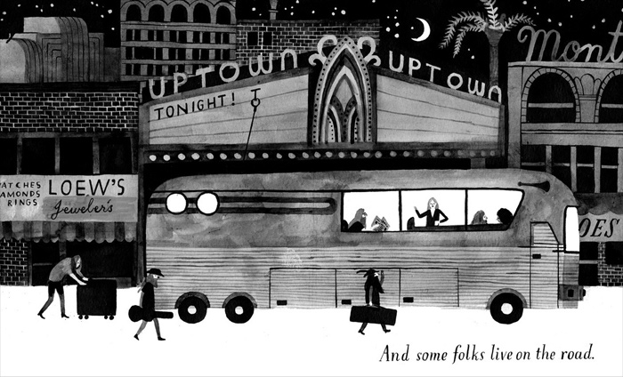
My husband is also a musician and our family has lived on a tour bus for months at a time. We've dragged my older son, Hank, all over the country on tour. He loves it and requested that he and Milo be on the bus in this illustration. And so they are, in the final art. Look for them.
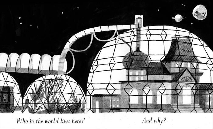
This one is for Hank too, who's been long-obsessed with terraforming planets. ‘Home’ feels like a book version of the collective consciousness of my family – all the things we love and are thinking and talking and reading about make an appearance.
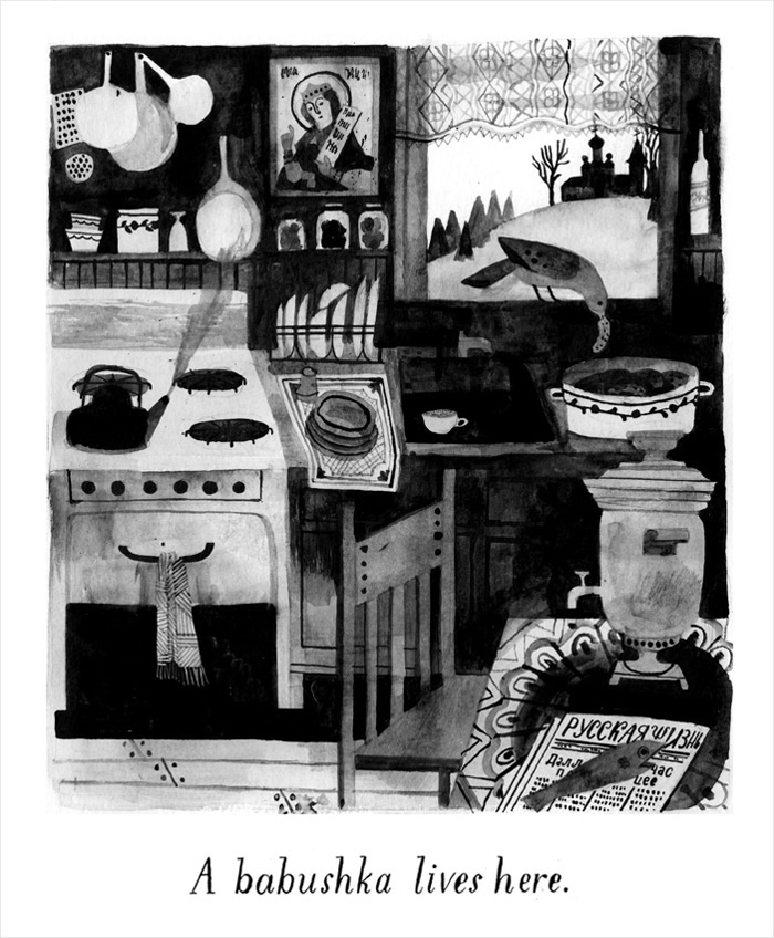
I'm a Russophile so I loved drawing this cosy babushka's kitchen, looking out over the taiga at a wooden church on a hill.
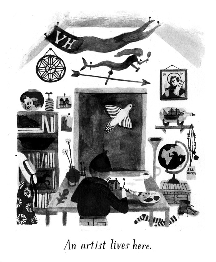
There was only one important edit that I made to ‘Home’ between those thumbnails and these sketches. Originally the book ends in the bedroom of a child, surrounded by artefacts from other homes in the book, with the line: A kid lives here. A lot of reasonable people who saw the book felt like there wasn't quite enough holding it together, that it was too unhinged, and that home, as a concept, might just be too broad. Which was fair enough. But my smart friend, Mac Barnett, suggested it end with me, in my studio.
Carson's studio on her farmstead in Oregon.
It was a little change but an obvious one that transformed the book profoundly for me. It's still a book about homes but now it's also a book about making art and celebrating the things that inspire us. Thanks, Mac! You're the best. Also, thanks to Colin, Steve, Jon Klassen, Lane Smith, and Amy Martin, who all gave me invaluable feedback and support. I hope you all like ‘Home’. It was a joy to make.
HOME © 2015 by Carson Ellis. Reproduced by permission of the publisher, Candlewick Press, Somerville, MA.
Home
Carson Ellis
Candlewick Press, United States, 2015
Home might be a house in the country, an apartment in the city, or even a shoe. Home may be on the road or the sea, in the realm of myth, or in the artist's studio. This is a meditation on the concept of home and a visual treat that invites many return visits.
‘Visually accomplished.’—Kirkus Reviews
‘It’s a work that confers classic gifts: time to look and time to wonder.’—Publishers Weekly
