< Back to posts
Shaun Tan
Australia
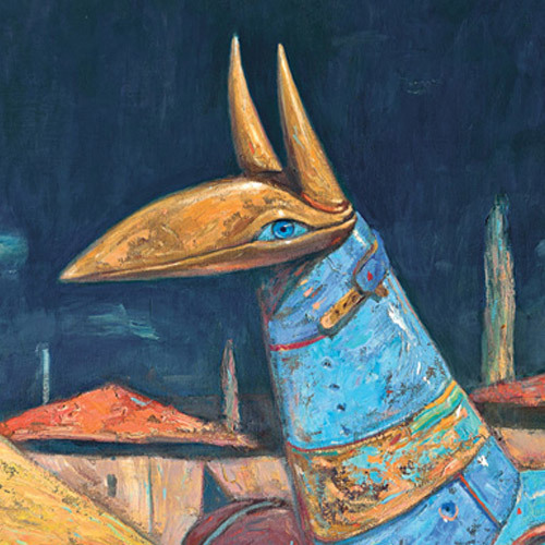
Shaun Tan grew up in Perth. As well as writing and illustrating world-renowned books, he's worked as a concept artist for animated films such as Pixar's WALL-E, and he directed the Academy Award-winning short film, ‘The Lost Thing’, with Passion Pictures Australia. In 2011, Shaun won the prestigious Astrid Lindgren Memorial Award.
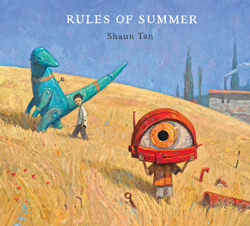
In this post, Shaun talks about the creation of ‘Rules of Summer’ and he gives a fascinating insight into his working process. This beautifully surreal picturebook was originally published by Hachette Australia in 2013, and has been translated into twenty languages.
Shaun: ‘Rules of Summer’ is a picture book that had a very long gestation, I'd been thinking about it for a decade or so, mainly trying to figure out just what the story could be. I routinely draw lots of little vignettes in small sketchbooks, like loose bones in search of some connective tissue that might lead to a narrative, and in this case that narrative proved very hard to find. I just had lots of scenes of two characters, modeled more or less on myself and my older brother as kids, getting caught in all manner of odd situations. Eventually it occurred to me to forget about story altogether – why not? In fact, one thing I love about picture books is an ability to depart from linear narrative, and particularly from explanation. I think readers appreciate that too, the ability to freely imagine what is going on in each picture.
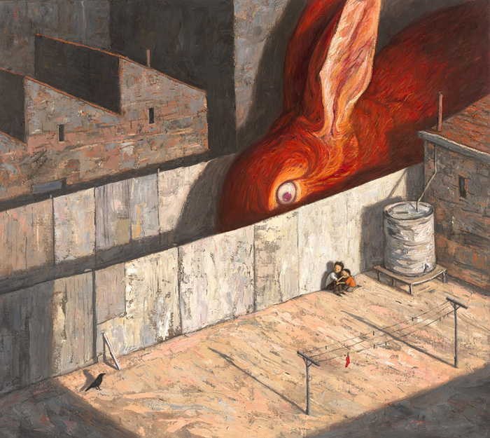
Just to give you an idea of what I mean, here are a couple of consecutive images with very spare text. ‘Never leave a red sock on the clothesline’ is a kind of self-contained little story of its own, albeit very enigmatic.
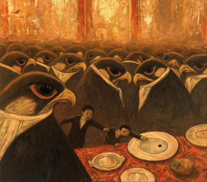
Turning the page finds us in another place altogether, with the cautionary line, ‘Never eat the last olive at a party’.
For me this kind of structure, or lack thereof, actually reminds me of childhood, the memory of which can feel quite jumbled and discontinuous. At the same time, there's a sort of emotional connectivity under the surface (always the same two boys with a particular power relationship), and that's always been my main interest: how we identify ourselves, and our values and desires, within a changing and unexpected world.
But rather than talk too much about overall themes, I thought it would be more interesting to focus on a single illustration, and look at some progressive ideas and sketches. I think I'm quite a slow illustrator, and have a habit of drawing the same images over and over again, and this is a good place to show a little of this working style.
First the concept, which usually comes to me as quite a vague mental picture. In this case, centred on the relationship between a person and a gang of oddball creatures, something along the lines of this much earlier illustration from my book, ‘Tales from Outer Suburbia’.
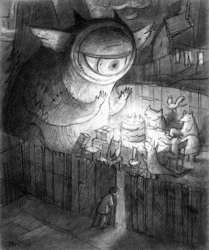
The creature with a single big eye in particular tends to recur throughout my work, as do scenes of humans trying to relate to non-humans, as you can see in this pencil drawing some years later.
It's a sort of evolutionary step, towards Rules of Summer (at the time just called ‘summer project’ in my filing cabinet) in which the focus has shifted to a relationship between two human characters, possibly a brother and sister. In the above drawing, one of them is enjoying a backyard birthday party while the other is left out, but we don't quite know the reason. Maybe he wasn't invited, or forgot to bring a gift, or shy, we just don't know.
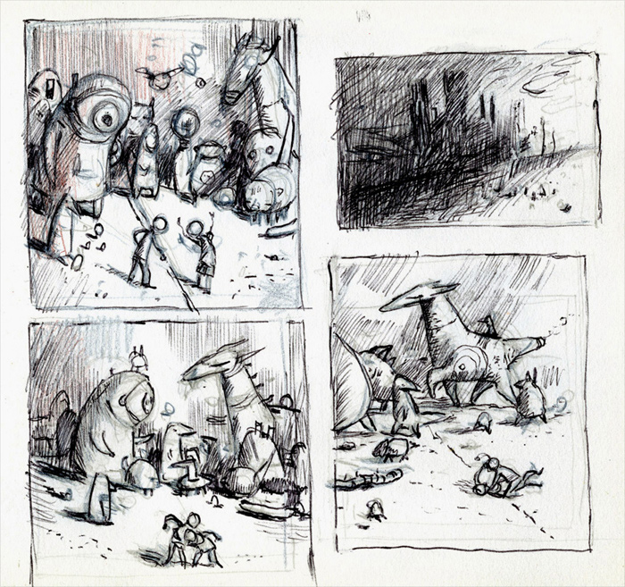
Here's another similar scene sketched with a biro, for a possible graphic novel: I plotted out some eighty pages before deciding it didn't feel quite right.
Here the two characters, now both boys, are having an argument over a boundary line, which leads to a fight. The creatures are a gang of dismayed onlookers, the idea being that they represent a deeper emotional knowledge beneath all the bickering. I still like these scenes very much, but unfortunately I could not wrangle a sustained tale out of them, and it all felt a bit overwrought.
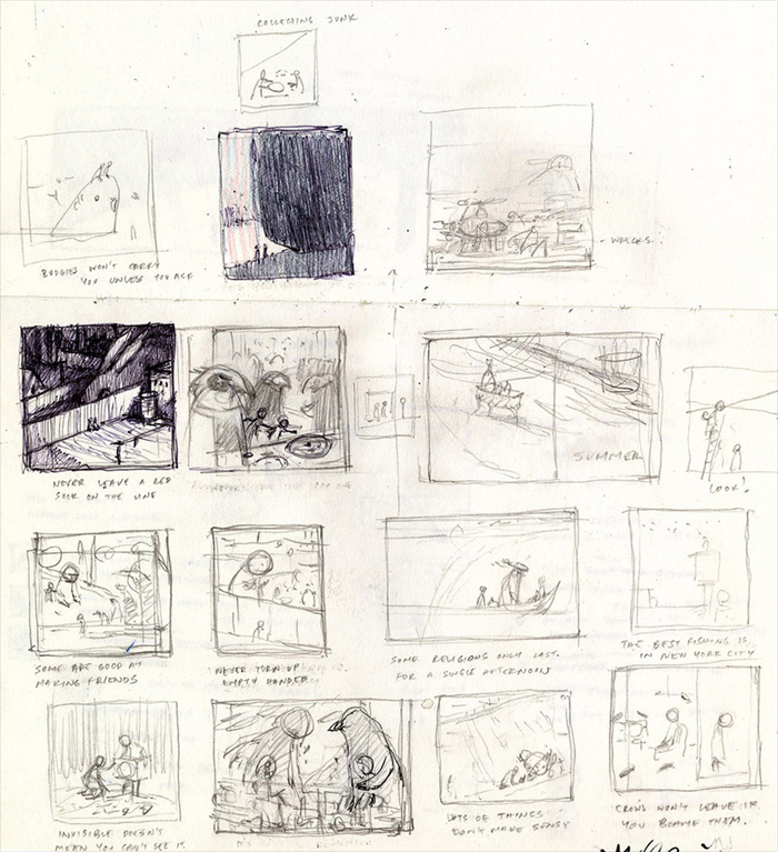
So then I thought, let's forget about storylines or sequencing, and just see how different ideas look when shuffled together randomly, as in this notebook doodle.
Most of these sketchy vignettes fell by the wayside, but not without establishing a kind of tone or loose scaffolding. One idea that survived was, again, this ‘creature-gang’ scene (hard to see here, with the caption ‘some are good at making friends’). I liked it because it reminded me of certain real childhood experiences.
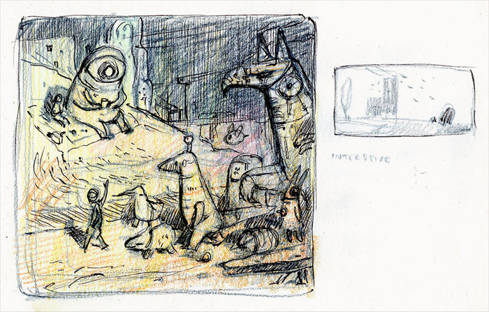
Here is the creature-gang doodle elaborated. What you can see is a group of several creatures marching along in the foreground, led by a boy who is waving to another boy in the background, who is reading a book beside a big creature on a hill.
The concept here has something to do with competition, pride and envy: one kid is demonstrating how good he is at making lots of friends – literally, since all the creatures are big robots – while the other is being left behind. Notably, a sort of boundary line is still present, defined by a road.
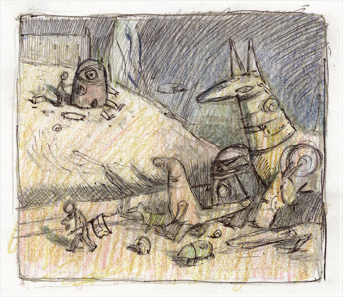
Here's the same scene sketched again, but with the emotional tone adjusted.
The boy on the hill is building the one-eyed creature, and is far from finished. The other, now more defined as an older brother, is essentially ignoring the younger and regarding his watch, his body language radiating impatience. The working caption was simply ‘don't be late’. I liked this variation because the relationship between the characters now felt slightly autobiographical. I identify with the younger incompetent one!
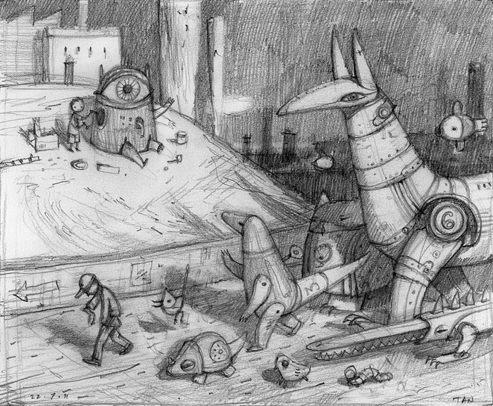
So once I think the concept sketch is working, I'll refine my drawings on a larger piece of paper. Often what I do is scan and enlarge the concept sketch, and trace over it on a lightbox to get the basic composition, and then refine each element.
My attention here is mainly on composition and character, how the viewer's eye moves through an image, and what emotional resonances can be conveyed – as well as getting the balance of weirdness and familiarity just right, with not too much of either. You want to invite the reader through the door without telling them where they are.
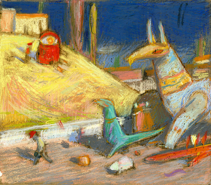
Next I'll create a small colour sketch using acrylic paint and pastel crayons, thinking about light, atmosphere as well at the way that colour can draw attention to certain details, such as the one-eyed creature on the hill. I wanted the mood of the painting to be delightful, partly because it's a fun scene, but also to contrast with a darker tension between the brothers. I always enjoy that kind of ambiguous mood.
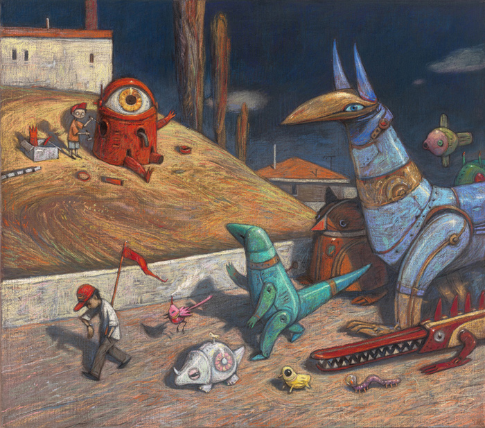
Now happy with the composition, I began working on a final painting with pastel crayons on a large bit of unprimed canvas, enjoying the softness and immediacy of this medium. While this painting is fine on its own, the feeling wasn't quite right for the book overall, perhaps a little too dark or static, the details a bit fussy.
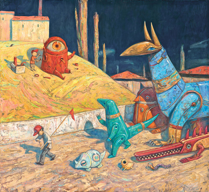
I started over again, this time working in oils, using mainly a palette knife to achieve a slightly less controlled texture, and hoped this might liven up the scene.
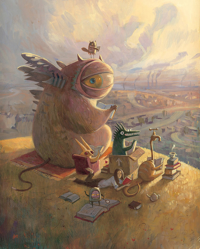
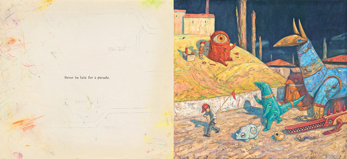
So here is the final oil painting, 30 x 34 inches, executed over several stages and taking about four to five working days.
The main difference is a brighter colour, closer to the original colour sketch, but you'll also notice some elements changed (a fish and bird removed, some buildings added). I don't think this is necessarily a better painting, but it's better for this moment in the book, which needed to feel sunny and bright. One advantage of oil paint is that it's easy to revise, unlike pastels. That's important when working on a series, as sometimes I need to go back and make little changes, anything from a character's face to an overall varnish of colour. While I can edit digitally, I prefer to get things right by hand as much as possible.
The final text accompanying the image is small and understated on the facing page, ‘Never be late for a parade’. It adds a little context without over-interpreting the painting, and the word ‘Never’ ended up as a connecting thread between all pictures, and ultimately informed the title, ‘Rules of Summer’. I will often rewrite the text multiple times as the last part of a book project, in part because it's far easier to change than the paintings!
So that's an example of one piece of a larger puzzle, and I always feel that the unseen evolution of an idea is as interesting as the final result. After all, that's the thing that gets me hooked as a creator, having a sense that something is bubbling its way to the surface, and really just wanting to see what it looks like! The complete work is often slightly surprising: oh, so that's what it looks like. Nothing to do but go back to the sketchbook and move on to the next one...
Illustrations © Shaun Tan.
Rules of Summer
Shaun Tan
Lothian Children's Books (Hachette), Australia, 2013
Combining humour and surreal fantasy, Shaun Tan pictures a summer in the lives of two boys. Each spread tells of an event and the lesson learned. By turns, these events become darker and more sinister as the boys push their games further and further.
'Visually fascinating.' —The New York Times
- English: Hachette Australia — Arthur A. Levine Books USA — Hachette UK
- French: Gallimard Jeunesse
- Dutch: Querido
- Norwegian: Cappelen Damm AS
- Portuguese: Kalandraka
- German: Aladin Verlag
- Portuguese (Brazil): Grupo SM
- Swedish: Kabusa
- Arabic: Dar Al Muna
- Chinese (Traditional): Grimm Press
- Italian: Rizzoli
- Japanese: Kawade Shobo
- Danish: ABC Forlag
- Spanish, Catalan, Basque & Galician: Barbara Fiore Editora
- Czech: Labyrint
- Polish: Kultura Gniewu Pawel
- Turkish: Tudem
- Korean: Pulbit
