< Back to posts
Emily Hughes
United States

Emily Hughes is an author and illustrator who grew up in Hawaii, and now lives and works in the United Kingdom. Her artwork has been widely exhibited and her picturebooks have received international recognition. In 2015, Emily was chosen to represent the UK in the prestigious Biennial of Illustration Bratislava (BIB).
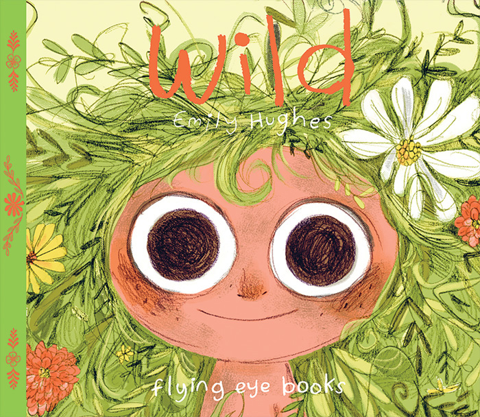
In this post, Emily talks about the creation of ‘Wild’. This boldly illustrated, beautifully produced picturebook was one of the first releases from Flying Eye Books in the UK. It's since been published in many other languages including Spanish, French and Italian.
Visit Emily Hughes's blog
Visit Emily Hughes's Facebook page
Emily: ‘Wild’ is a story about a feral girl. Or it's about people who have a hard time fitting into societal expectations.
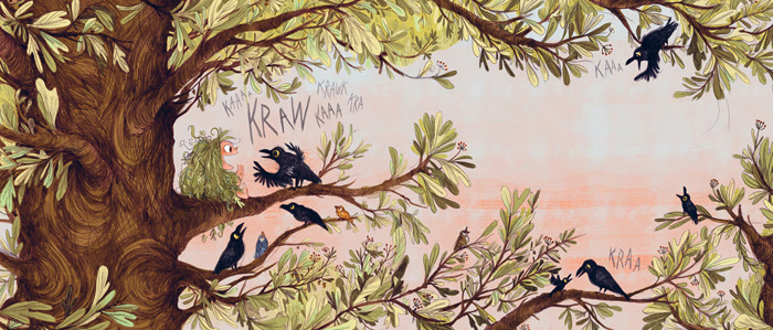
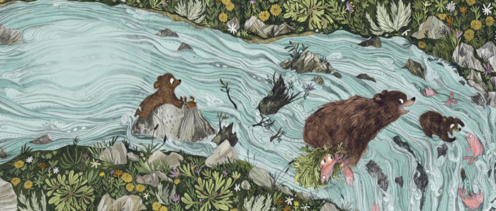
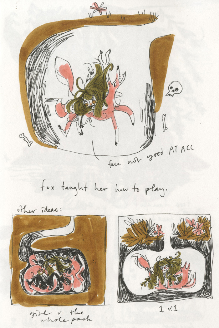
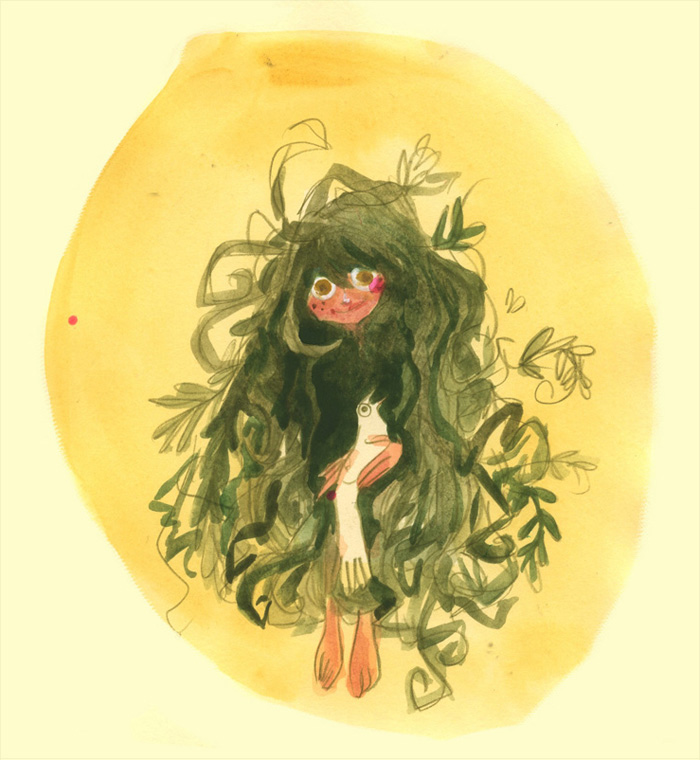
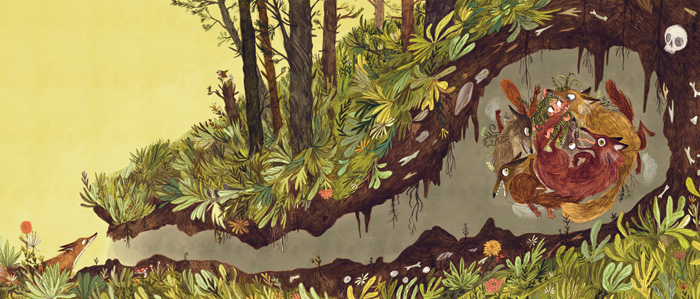
This unnamed girl lives outdoors and has been raised by the forest community: crows who talk and squabble with her, bears who teach her how to fish for her supper, and foxes who nip, play and encourage her strength. There are no other requirements to live this lifestyle; she can communicate, empathise and understand this hodgepodge family, and she lives a life that is unclouded and understood.
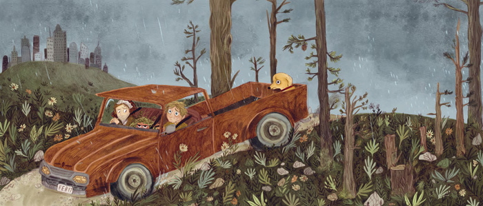
One day, man enters the forest and takes the girl away, believing it isn't right for a human to be alone – for a human to be living harmoniously amongst the trees, hills and animals – for a human to be ‘wild’.
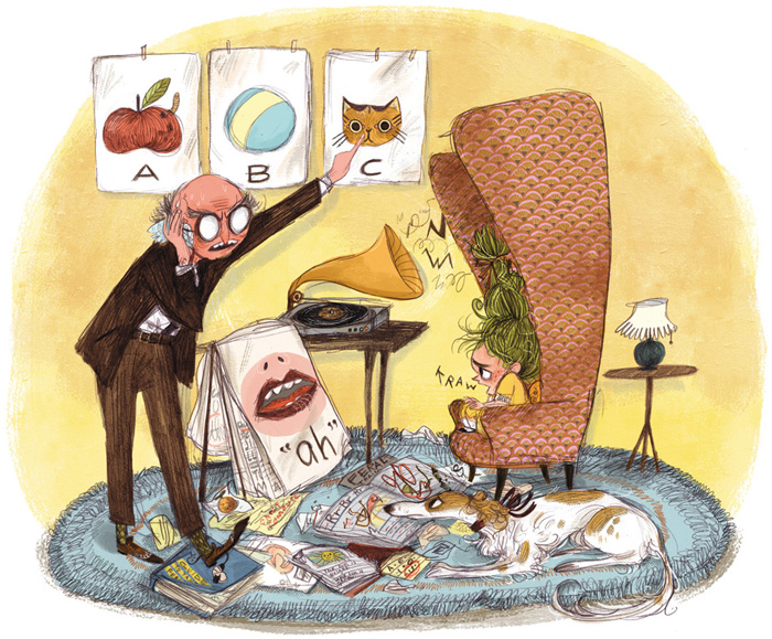
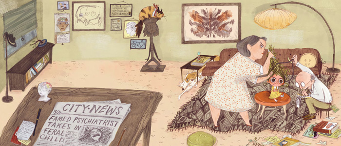
With that agreed thought, two humans begin the daunting task of ‘curing’ her. Her hair is brushed, she must learn to speak properly, to use a fork neatly, to listen to and obey all of these important rules that have absolutely no importance, sense or use to her.
Flying Eye Books required a story pitch. I think I only had a month or so to pitch it if I were to have a book out the following year, so I had to quickly think of a storyline.
Initially, I wanted to do ‘Wild’ in a Victorian setting because it was so repressive and I thought the contrast would be more defined. Talking about it with the art director, Alex, we decided it might be nicer to make it feel more mid-century to be less predictable. I think it was a solid choice.
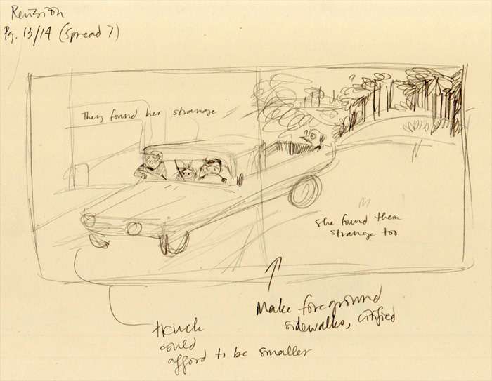
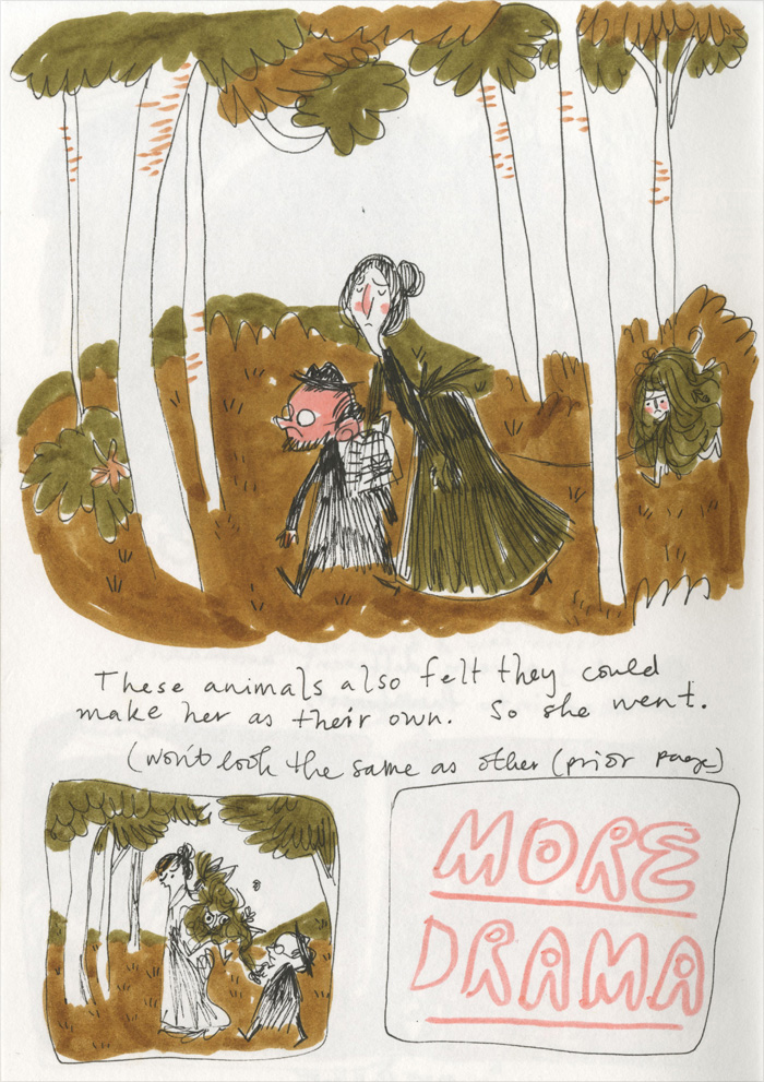
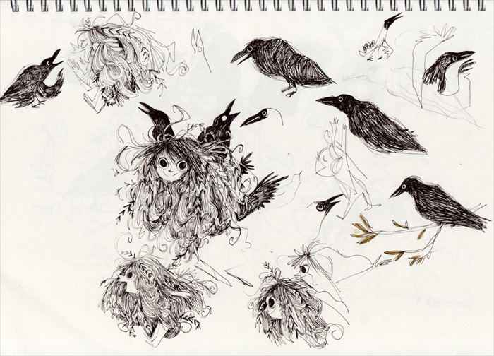
I started with a little dummy book. I usually use an A5 sketchbook and try to make little vignette images to encapsulate an idea. As I usually work with one image and one line of text at a time, I have to be very thoughtful and ruthless at this point of editing. Having few words and little space for images to get the story across is a challenge, but it helps me to better define the story. If I cannot tell the narrative within this dummy book, there are reparations that need to be made – and with ‘Wild’ there were plenty!
(In these sketches you can see it was originally the psychiatrists who find the girl in the woods, not the hunters.)
Character design is vital, and it takes me a long time to get into the design until I find it appealing and identifiable. I have pages and pages of Wild girl drawn out, trying to make sense of her.
While we all try to empathise with Wild girl, we have to also empathise with the adults. The psychiatrist has a lot at stake; he's publicly announced in the newspaper that he's taking on this case. This is his chance – potentially the pinnacle of his career. He is wrapped up and fails to see the girl as anything but a case subject. His wife, on the other hand, is dedicated to being what a woman of the time should be: The household needs to be orderly, children orderly, life orderly. Terribly mundane. But now it is a challenge with a girl so equipped for destruction. These are characters who are unhappy in their positions: the deluded doctor, the disgruntled and rigid wife. All having a hard time filling the positions society expects them to fill.
I enjoy the period of analogue drawing; I can have TV or music on in the background. For ‘Wild’, I used a mechanical pencil and 0.5mm B lead if it's of any interest, though the technique is available and understood by nearly everyone. I have the bad habit of getting nervous when starting a final and sometimes make the unwise decision of drawing the main focus last – initially concentrating on the background. I think this is why I end up with so many flowers.
Then it's the colouring period. I do it all digitally in Photoshop with help from the multiply tool on the original scans. That's about as much as I know how to do in Photoshop; yipes!
The outdoor scenes were more natural for me to do; lots of greens and browns (brown being my favourite colour; maybe it's obvious throughout my work).
The interior scenes were tricky. There was so much empty space, so many hard edges. I was conflicted with either using saccharine colours of mid-century furnishing or more conservative colours I found in my grandma's house. There's a bit of ugly bright colour, but for the most part it's still muddy. I wasn't very daring with my references; I managed to mix my TV binging with research, so ‘Mad Men’ made appearances – especially the earlier seasons. Boxy, stuffy, drab.
This was my first book in the working world, and I have made a handful since then. Although I feel like my drawings have changed a lot since, I feel the making of this particular book has had the biggest impact on me. Working on it has helped me to open my eyes – to try to train myself to be tolerant and accepting of those wild and tame alike.
Illustrations © Emily Hughes.
Wild
Emily Hughes
Flying Eye Books, United Kingdom, 2013
We meet a little girl who has known nothing but nature from birth. She was taught to talk by birds, to eat by bears and to play by foxes. She is unashamedly, irrefutably, irrepressibly wild...
Until the day she is snared by some very strange animals that look surprisingly like her...
- English: Flying Eye Books
- Spanish & Catalan: Libros del Zorro Rojo
- Italian: Settenove
- French: Casterman Jeunesse
- German: S. Fischer Verlag
- Dutch: Ballon Media
- Danish: Turbine
- Bulgarian: Ribka
- Portuguese (Brazil): Zahar
- Korean: Dhampus
- Chinese (Simplified): Dolphin Media
- Chinese (Traditional): Sun ya
