< Back to posts
Klaas Verplancke
Belgium
Klaas Verplancke graduated from the Sint-Lucas Institute in Ghent, and after several years working in advertising, he became a full-time illustrator and author. Klaas has won the Bologna Ragazzi Award, he was a finalist for the Hans Christian Andersen Award, and he's been nominated for the Astrid Lindgren Memorial Award nine times.
In this post, Klaas talks about the creation of his hugely successful picturebook, ‘Appelmoes’ (Applesauce), and he shares previews from forthcoming books. He also discusses artistic freedom, the difference between the English-speaking and general European children's book market, and the respect and admiration he has for children.
Visit Klaas Verplancke's website
International ‘Applesauce’ news
Klaas: One thing that I've learned over the past twenty-six years is that stories need time to grow and mellow. The initial thoughts for ‘Applesauce’ came into my mind ten years before the book was published.
I've always been fascinated by children. They are, at the same time, strong and vulnerable creatures: eager to explore, to experience, to discover, and to jump fearlessly into the unknown – so long as they know that at the end of every adventurous road, there are open arms in which they can find rest, safety, care and comfort. That's what they expect from us as adults, parents, teachers... I wanted to capture this duality in a story, and started working on storylines where loneliness and snugness came together.
The first sketchy storyboard was conceived with a young polar bear that wakes up from his winter sleep. His mother is still asleep, but he can't wait to get up, and leaves the warm hollow to discover the world outside. But he gets lost in the whiteness...
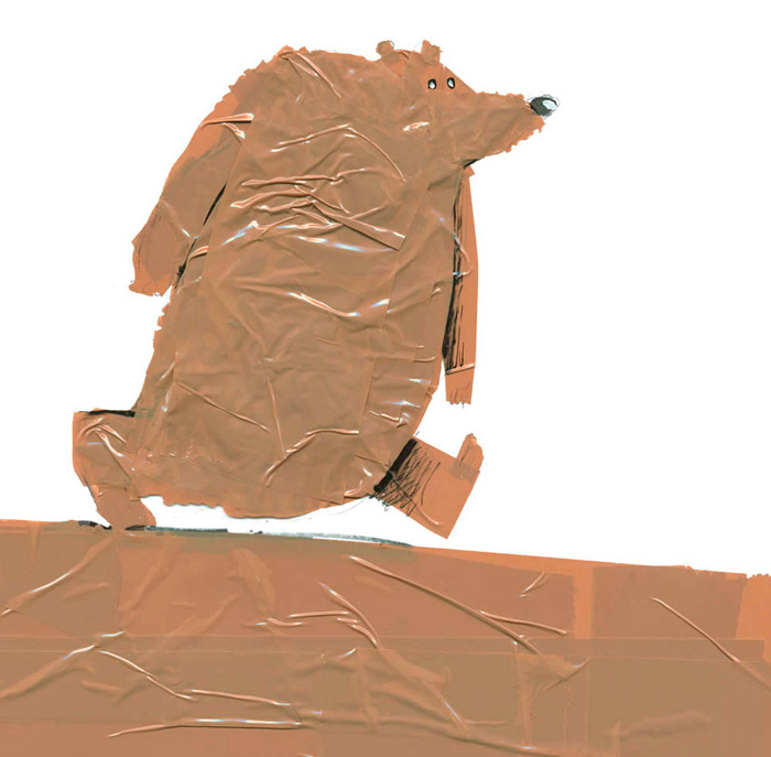
I created this Bare Scare Bear with tape for another storyline.
This story was based on the uncomfortable feelings of desertion in a king size bed (an experience that I remember from my childhood, when I stayed at my grandmother's house and had to sleep in a large bed in a half-dark room, full of strange objects, paintings and vintage portrait photos). A good old teddy bear comforts the child from this annoying and frightening bedroom creature, and keeps her company.
There were more storylines that were easy to start but hard to finish. The ending is the most important part of a story. It must recall the beginning so that the story can go around and around...
But as a young father, everything changed. Simple, real-life stories were happening all around me. Every day in a child's life is unique because there's so much to learn. Every question, every doubt, every trouble can be the beginning of a tale.
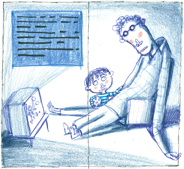
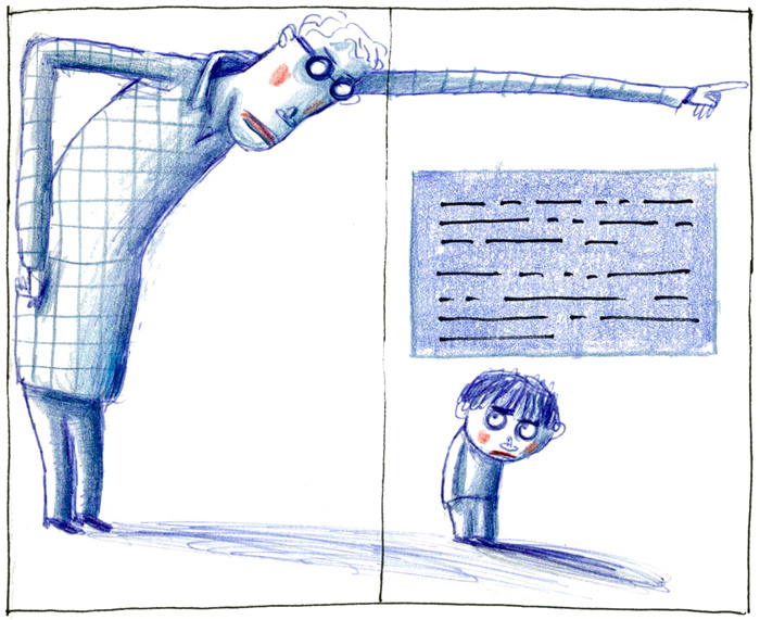
I experienced that being a father is very complex and illogical as seen from a child's viewpoint. How can you be a sweet friend and a strict and punitive boss at the same time? My son turned away when I, his best friend, was angry or severe. He ran away and hid, in his anger, frustration and confusion. Lonely, looking for a new father... and there it was: the story I'd been trying to find for years, ready-made. Fathers and sons, parents and children, can be very, very close – but far, far away from each other too. Just then, a father must open his arms as the doors of a welcoming home, when the anger and trouble is left behind and the child wants to return to his friend.
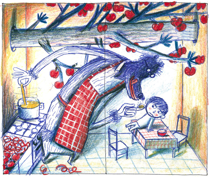
I tried a first version of the story with a bear (again!)...
But I decided to drop this idea. And it became the picturebook of ‘Applesauce’, about a real father and a real son, about real parents and real children.
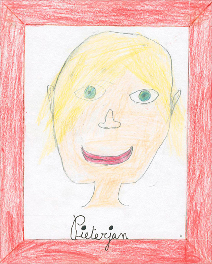
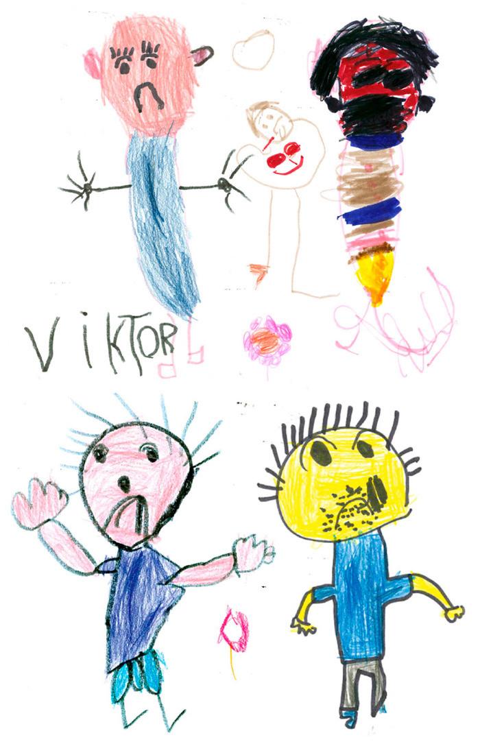
For the artwork, I started with this self-portrait made by my son when he was five years old.
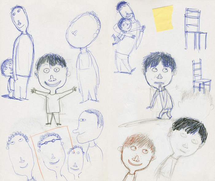
We have a preconditioned vision of childish aesthetics. We associate it with round and soft shapes. But look how sharply this is drawn. I was really fascinated by this drawing, and used it as a starting point for my character design. I slowly adapted and moulded it to my drawing, but tried to keep some references (like how the nose looks like it's glued to the face).
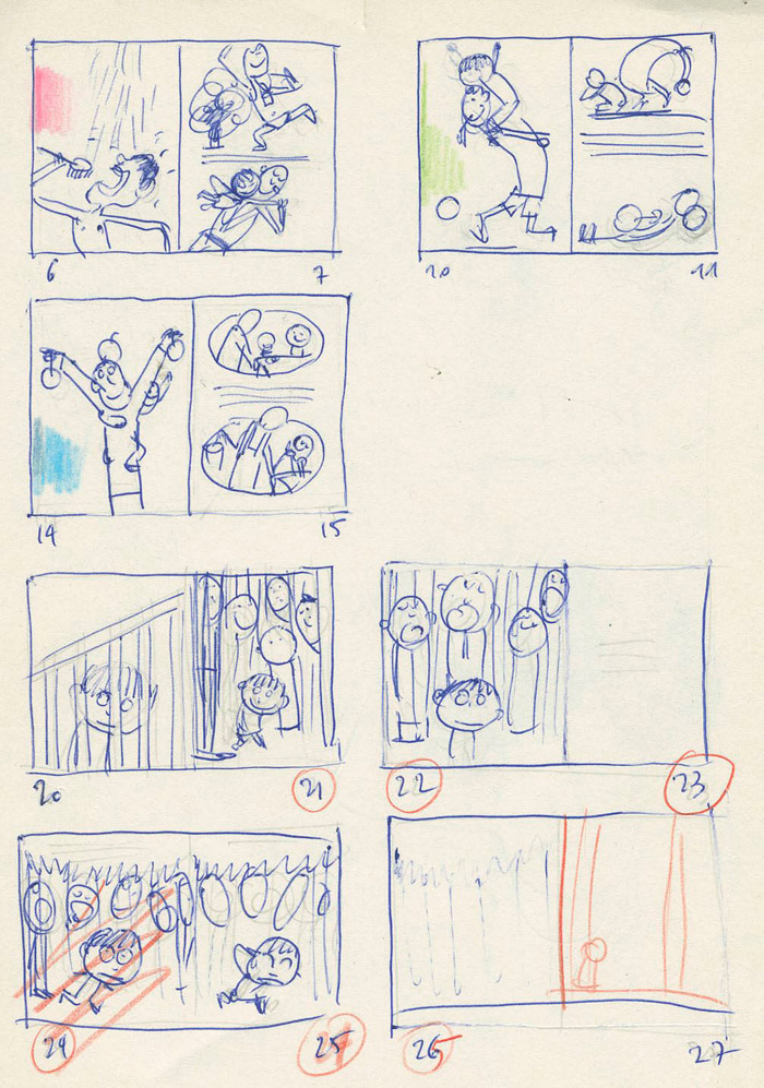
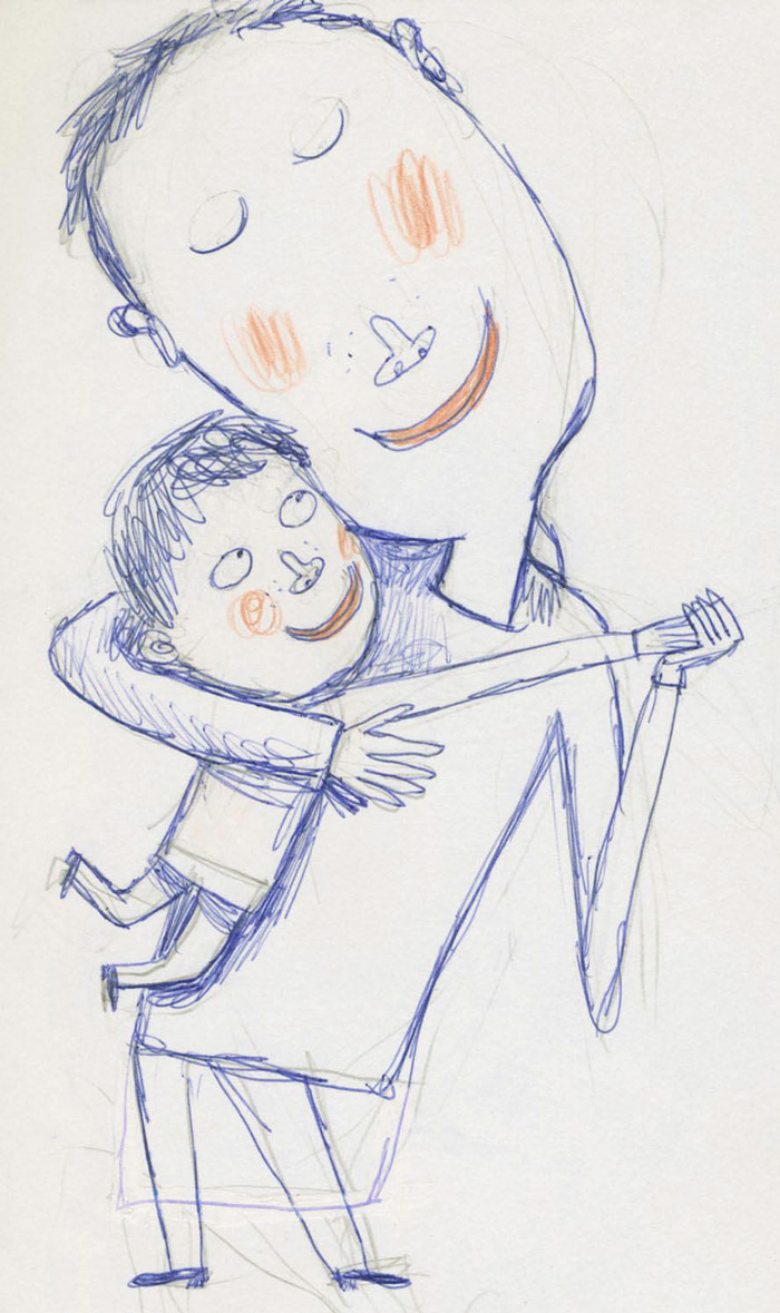
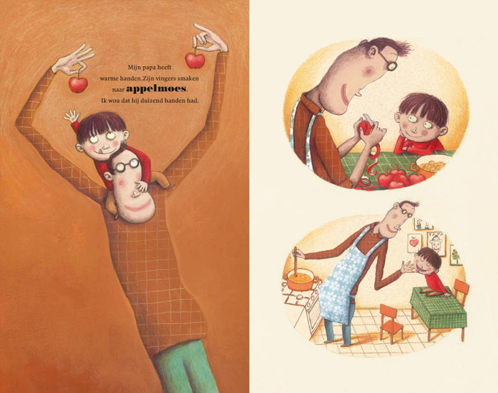
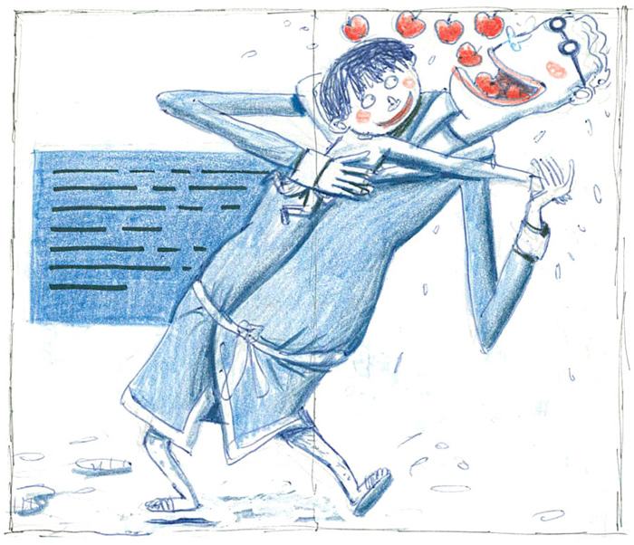
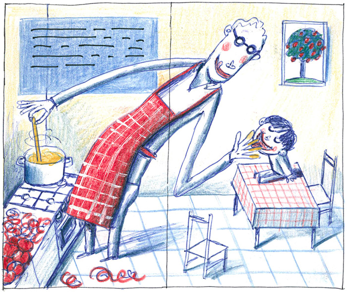
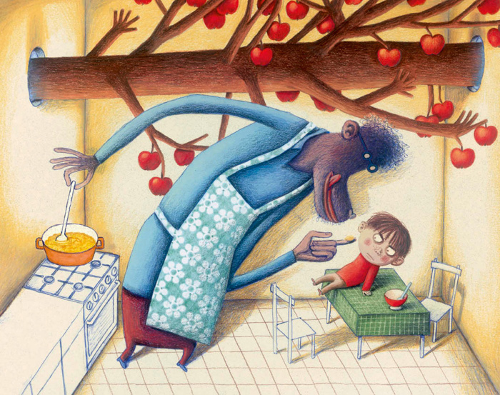
I made the sketches in ballpoint pen. When I showed my storyboard to Guy Billout and his illustration students in New York, he suggested that I maintained this style and technique in the final artwork. I loved this idea, and it inspired the colour rhythm I used in the book. Alternating between warm colours and cold blues to enhance the warmth and the tension in the scenes. Thus, I tried to create a sort of wave effect in colours, executed in acrylics and coloured pencils.
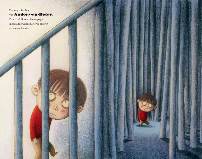
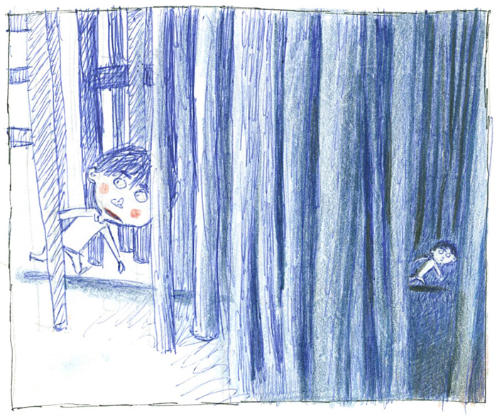
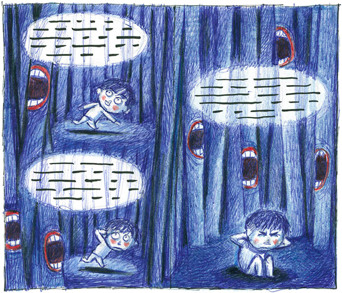
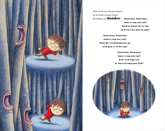
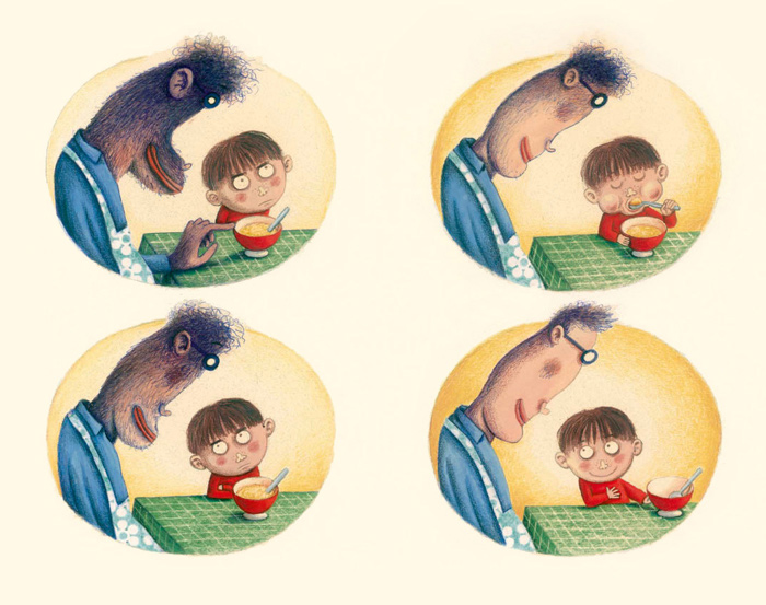
This book also incorporates my typical filmic style, with great attention to composition, lighting, repetition and transition (like the staircase pillars that turn into trees – my son's favourite spread).
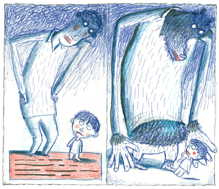
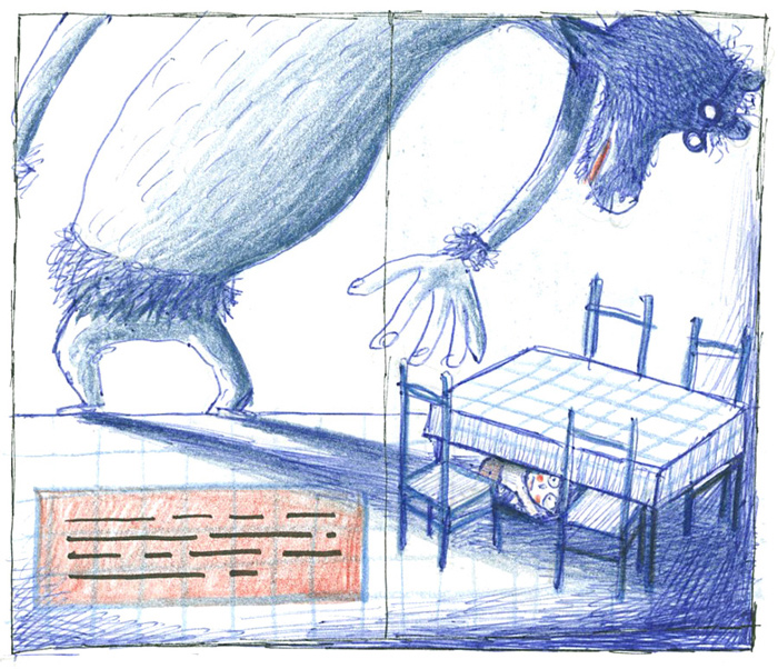
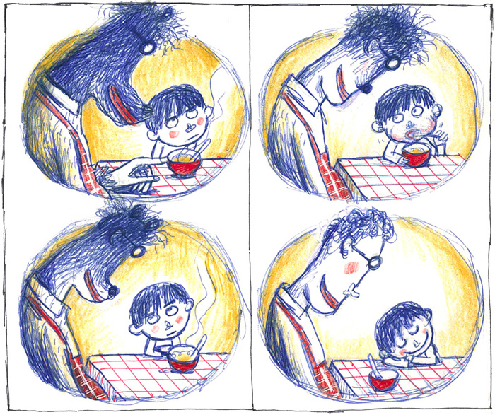
The first storyboard for ‘Applesauce’ was longer, more complex and very different from the final one. The passage in the forest was longer and darker, and the whole story was written from the viewpoint of the father. I focused on the father's anger and the child's fear. This created so much contrast and such a dramatic effect, that it became really threatening from the child's viewpoint – a result that I didn't want, given my respect and admiration for children.
I absolutely didn't want to put children in this difficult position, so I flipped the viewpoint and added self-respect to the boy's reaction to his father. I worked hard on this scenario, with the help and feedback of my publisher, Marita, who pointed out and removed the imbalance and apocryphal elements. The storyline looks very simple and clear now, but I really had to kill my darlings to get to this point. You draw a lot to draw little.
The reason for the international success of ‘Applesauce’ must be the fact that it's a very universal, recognisable story for all parents and children in the world who deal with the same daily situations. It's my first translated picturebook in the English-speaking book market, published by Groundwood, a Canadian publisher.
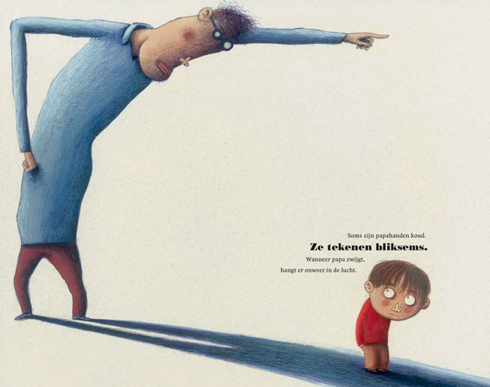
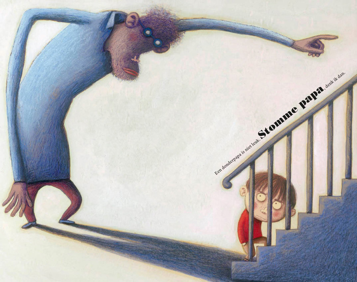
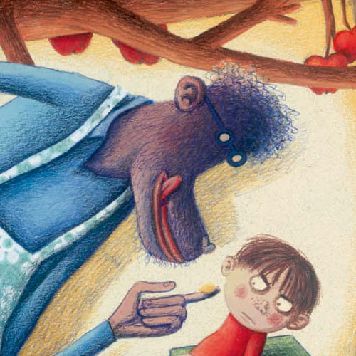
Apparently, I found a good balance in this book, but even so, the most negative reactions come from reviewers in the United States. Different expectations lead to different evaluations. In particular, the scene with the angry dad transformed into a stupid kind of ape, and the passage through the forest seems ‘too scary’, ‘too sophisticated’, ‘disrespectful’...
In the late 90s, I worked for several UK publishers (with an agent), and I stopped after a few projects because I noticed that my artwork and artistic approach didn't fit with the typical illustration style in (mainstream) UK picturebooks. We had several discussions. I didn't feel comfortable with the adaptations I had to make to my illustrations and the final outcome of the publication. Mainly because most of these interferences weren't essential (smaller nose, rounder eyes...) and didn't relate to the storyboard.
I don't want to generalise, and there are always exceptions that prove the rule, and the market has changed a lot over the past twenty years thanks to smaller publishing houses, but one cannot deny that there's still a difference and a gap between the English-speaking and the general European children's book market – caused by different expectations and intentions. Just walk through the halls at the Bologna Book Fair and you immediately see the differences.
Children's literature on one hand can be seen as a romantic medium for social and/or religious education and easy entertainment, or on the other hand it can be considered as a form of art: confronting, reflecting and giving a voice to sometimes uneasy topics, emotions and thoughts. I've always worked according to these latter principles here in Flanders, where there's a great respect for artistic freedom and authenticity.
As I wrote before, I do have the highest estimation and respect for children. Picasso once said that he tried his whole life to draw as a child. Children are wonderful creatures who turn a yellow sphere into a sun. Life could be that simple. I'm jealous of their guts, their happiness, and the smart, simple logic they apply to learn about and understand the world around them. They are not fragile creatures that should be protected from every conflict or evil, or grow up with the illusion that life is a Barbie world.
On the contrary. Children do have a malicious side, and they seek suspense and adventure. Their drawings of an angry dad are even more scary than what I've drawn.
Children are sometimes lonely, scared, angry or confused. Real stories can help to deal with real life, making us more prepared and confident. That's why books and art in general is made. Recognition as a form of consolation.
In assessing books, one mistakenly starts from the perception that ‘not understanding’ is equal to ‘I don't like it’. “We think we understand the rules when we become adults, but what we really experience is the narrowing of our imagination,” said David Lynch.
Maybe we should assume that ‘not understanding’ creates fascination and imagination – that friction stimulates solutions and nuanced thinking, that we should understand that there is something called mystery, and that children intuitively assume that they need to learn if they want to grow. Let me quote Guus Kuijer: “If we don't want to learn, then everything is elitist and unintelligible, even opening a door.”
I always get curled toes at the discussion of the suitability of books for children. One always throws all children on a pile, as if ‘The Child’ exists. Like a baker would bake his bread for a particular kind of child. What if we applied this reasoning to adults? Not all adults understand and read Kafka's books. So the books of Kafka are not suitable for adults???
I didn't want to repeat myself or compete with myself immediately after the publication and international success of ‘Applesauce’. So I focused on other genres and target groups to change my horizon.
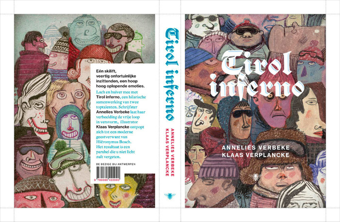
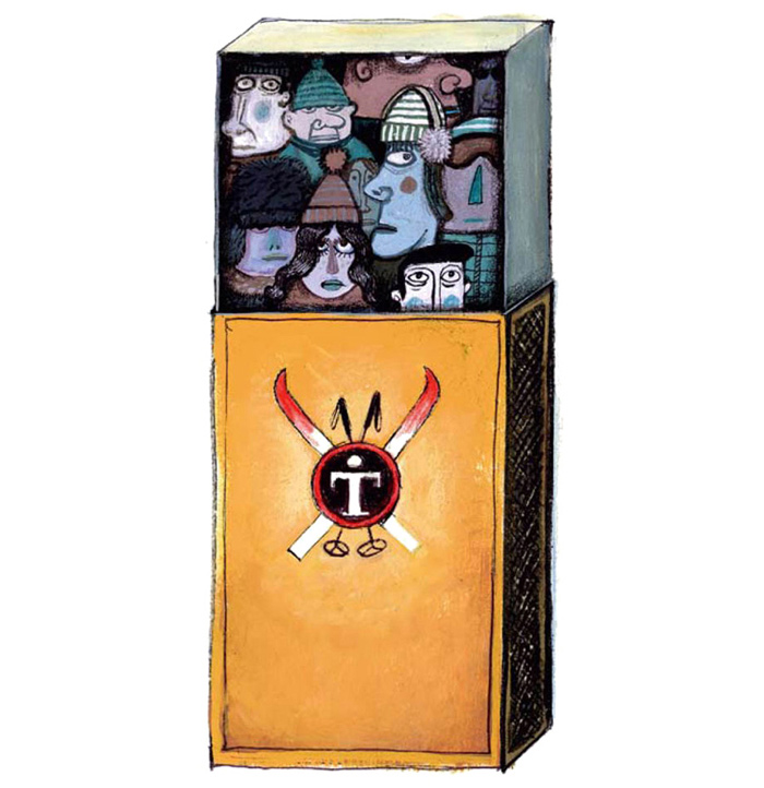
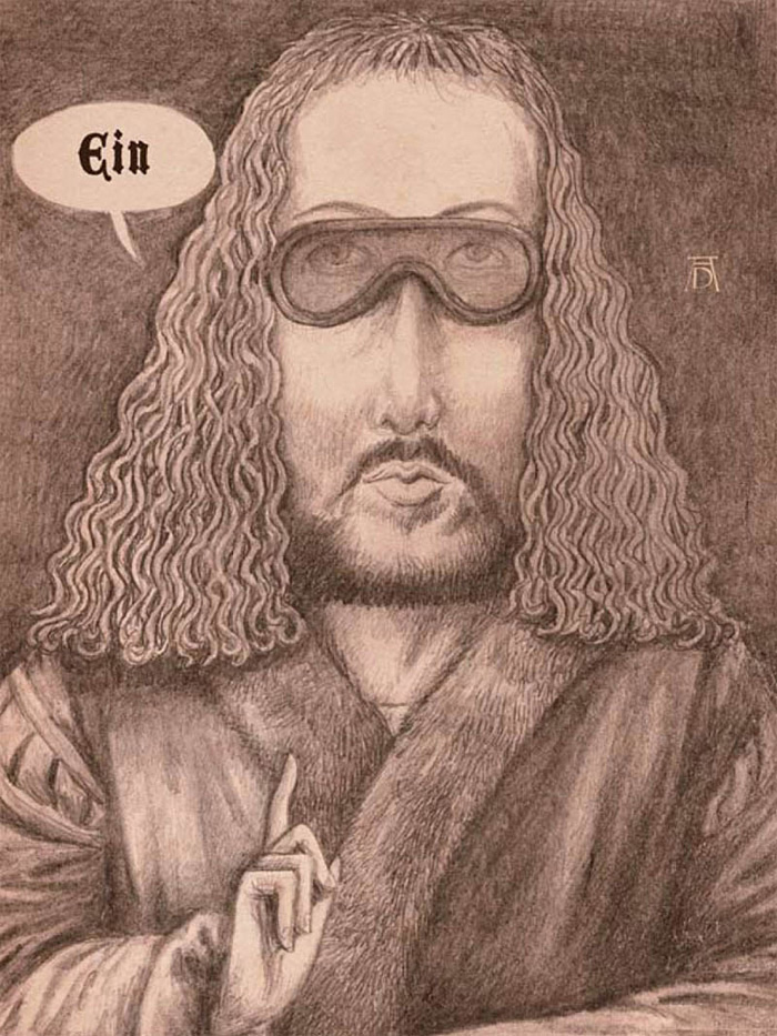
I illustrated some books for adults...
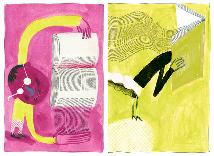
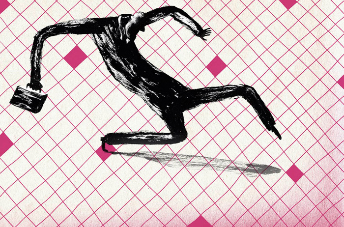
And I relaunched my career in editorial illustration (for The New York Times, amongst others).
My way of thinking doesn't change, but variety in creative work inspires and exercises the flexibility of my brain, because every medium needs a different execution. An editorial illustration is like a quote: fast, catchy and substantive on its own, speaking for itself. Book illustrations are a chain of key moments, feelings or thoughts, all related to each other.
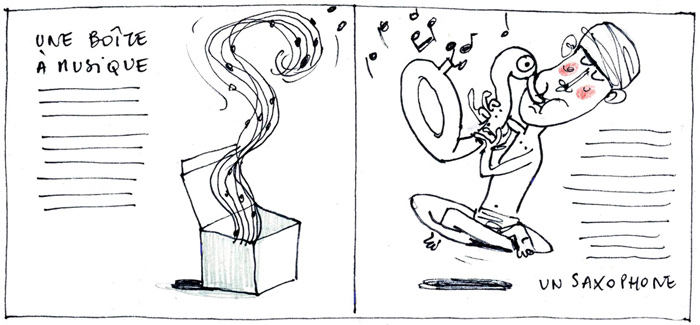
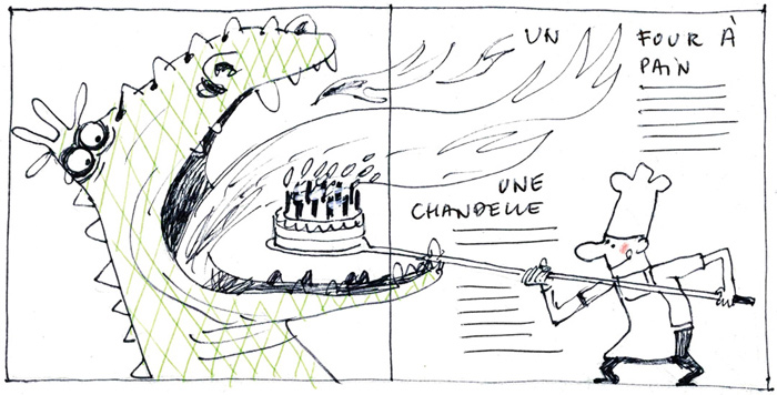
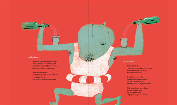
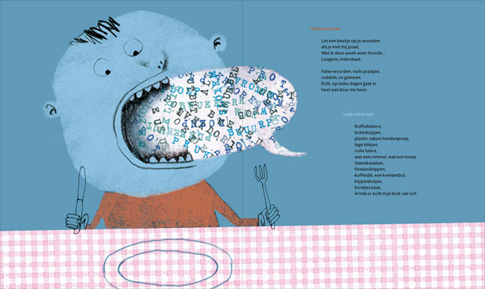
My first book for children since ‘Applesauce’ is a collection of funny monologues by daily objects. I created a new style and technique for this project, inspired by vintage Polish and Russian picturebooks. This also helped me to choose the remarkable colour palette. Every spread combines two objects in one surrealistic, weird or crazy scene. The text is enigmatic, so the child has to guess what talks. The objects are then shown on the next spread, in a collaged combination of illustration and photography.
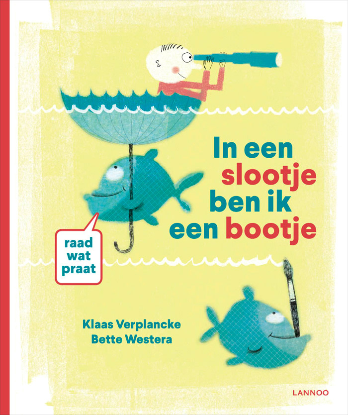
Google translates the book's original title to ‘Words of a pan and other odds’ (this title was then changed to ‘In a ditch I'm a boat’, with the subtitle, ‘Guess what talks’). The first book in what has to become a series will be published in March this year (find out more here).
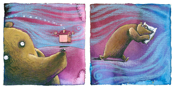
Here's the cover, some development work and an exclusive look at two finished spreads.
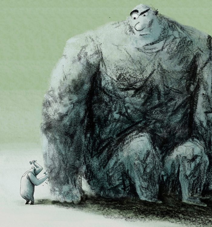
I'm currently working as art director on an animation project called ‘The Happy Stonemason’. There will be a picturebook spin-off based on this.
And finally, I’m working on a new picturebook based on my own script. But this is top secret!
Illustrations © Klaas Verplancke.
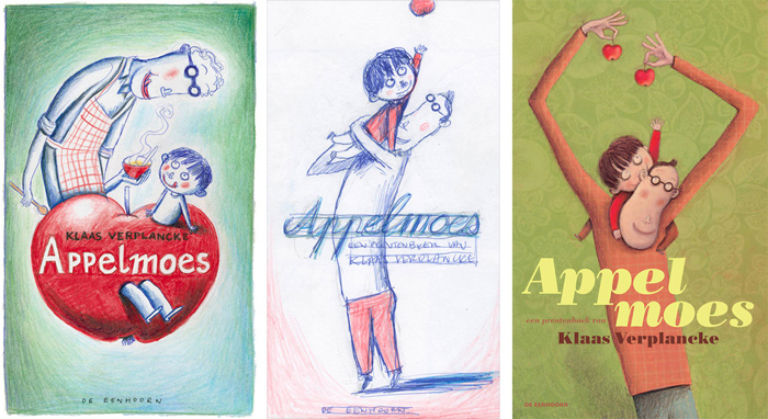
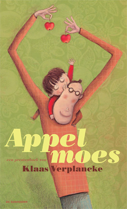
Appelmoes / Applesauce
Klaas Verplancke
De Eenhoorn, Belgium, 2010
Johnny’s daddy has smooth cheeks, an apple in his throat and he sounds like a mummy when he sings in the bath. He has warm hands and his fingers taste like applesauce. But sometimes his hands are cold and flash like lightning; he becomes a thunder-daddy. When this happens Johnny wants to find a new daddy... But he eventually realises that thunder-daddies don’t last forever. And that there’s nothing like the comfort that comes from those we love.
‘Spare of words but rich in feeling, this love note tracks some ups and downs but circles back to an attachment so warm and close that only the stoniest of hearts will remain unaffected.’—Kirkus Reviews
- Dutch: De Eenhoorn
- English: Groundwood Books
- Spanish: Ediciones Ekaré
- Swedish: Turbine Forlaget
- Danish: Turbine Forlaget
- Portuguese (Brazil): Scipione
- Croatian: ArTresor Naklada
- Korean: Kyowon Co.
- Japanese: Asahi Gakusei Shimbun Sha
- Chinese (Simplified): Petrel Publishing House
