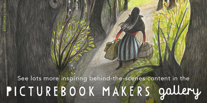
< Back to posts
Tara Books: Jonathan Yamakami
India

Jonathan Yamakami is a graphic designer from Brazil. After gaining a degree in Journalism from the University of São Paulo, he worked for five years with Conrad Editora in Brazil, and then for two years with Tara Books in India. In 2011, he moved to Rhode Island to pursue an MFA in Graphic Design. Jonathan currently lives in New York.
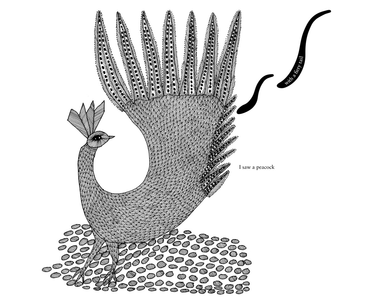
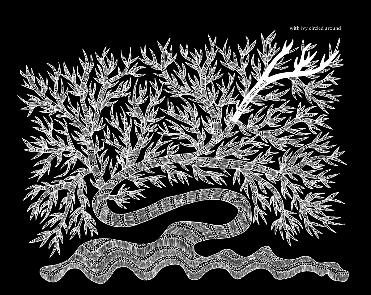
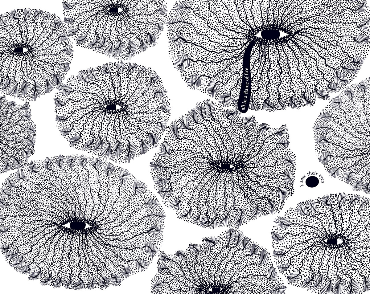
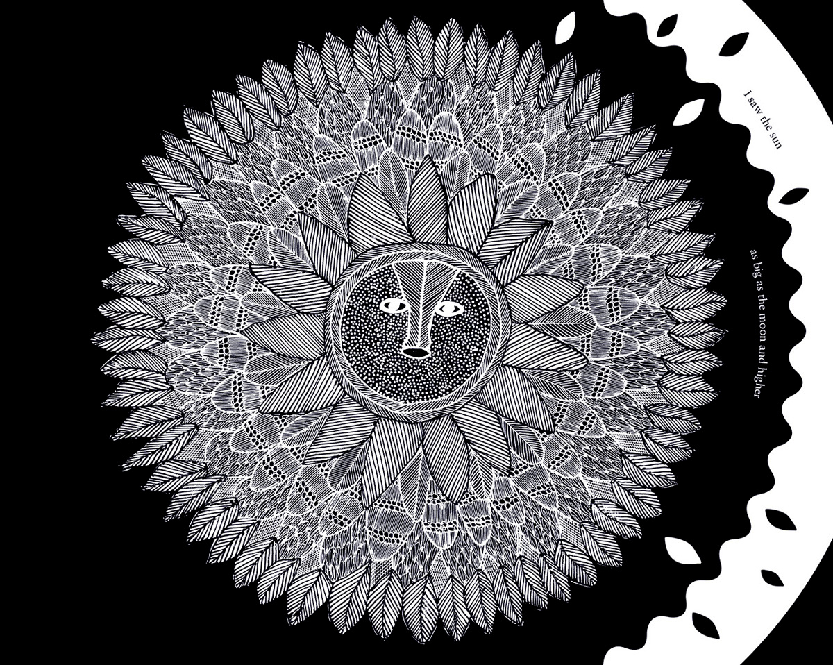
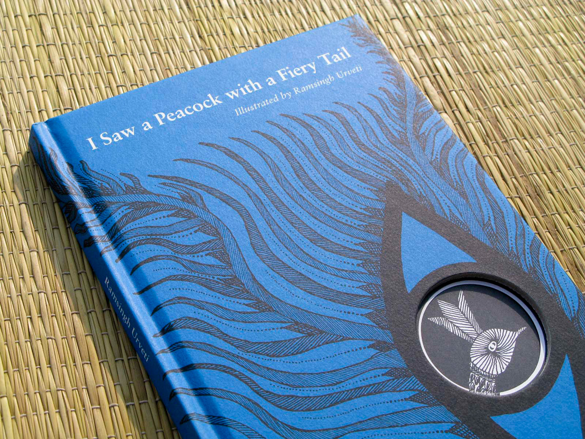
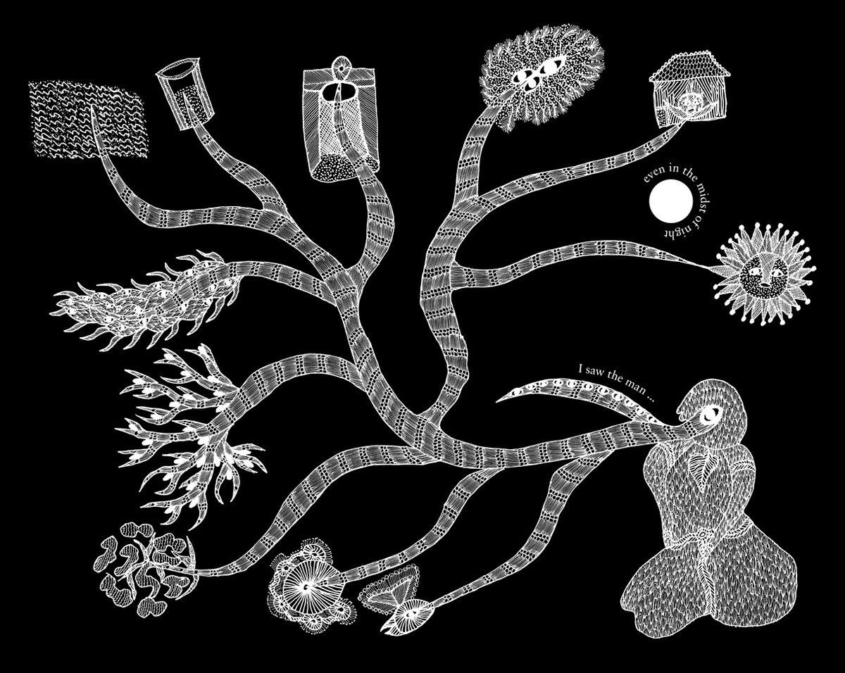
In this post, Jonathan reflects on his experience working on the exquisite book, ‘I Saw a Peacock with a Fiery Tail’ with Tara Books. This edition of the 17th century English 'trick' poem was illustrated by Ramsingh Urveti, who is one of the most brilliant living artists of the Gond tradition. Ramsingh has won numerous international awards.
Visit the Tara Books website
Visit Jonathan Yamakami's website
Jonathan: There was one thing that always struck me during my time as a designer with Tara Books. The number of projects which were waiting in line for someone (in this case a graphic designer) to claim them – no doubt the result of the creative energy of an office constantly brimming with new ideas. Looking back now, ‘I Saw a Peacock with a Fiery Tail’ – a project that took almost two years to complete – was emblematic of my stay with Tara. It taught me a lot about book design and how essential time is in order for a project to mature. It illustrated the importance of collaboration while showing me that a designer must inevitably find their own voice in the midst of different opinions.
I remember the first time I saw the work of Gond artist, Ramsingh Urveti. Around the same period, I had been involved in designing another book, ‘Sita's Ramayana’, a graphic novel with illustrations by Patua artist, Moyna Chitrakar. Moyna’s beautiful panels were so vivid and colourful, that Ramsingh’s black and white work felt to me like a quiet respite. It was silent and reserved and, for lack of a less obvious word, poetic.
As for the 17th century ‘trick’ poem, I was not familiar with it. It goes like this:
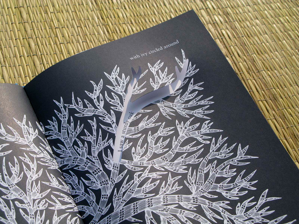
From the very beginning, the main question to me was: how do we create a book that presents both readings without actually printing the poem twice? A lot of different solutions were considered. I think Gita Wolf (Tara publisher) was the one who hinted at the direction of die-cutting, although she was still open to other possibilities. Using transparent paper and printing with two colors was another suggestion, but there was an issue of cost and, more importantly, it just seemed too complex for a poem that was in itself so simple. After all, once you crack the puzzle that it holds, you can't help but wonder how you could have missed it to begin with.
We decided to pursue die-cutting as a solution and here I have to mention Katsumi Komagata, even though I never had the opportunity to meet him in person. I'd been a fan of his books for a few years and I was pretty excited when I found out that everybody at Tara shared the same admiration for his work. I remember seeing one of his books, ‘Namida’, for the first time when I was in Japan in 2007.
Now this is interesting because Tara had a good collection of Katsumi's books in the office, but ‘Namida’ was not one of them. After I came back to Brazil, I saw this book on my shelf. I didn't remember what the cover looked like, but I was so surprised when I saw it! It shows how much influence Katsumi had on ‘I Saw a Peacock’. Often while working on this project, I wondered what Katsumi would think of this book.
Below is the first dummy that I made. The cuts were all rectangular and quite functional: they existed so that the text on the following spread could be read. It's a bit hard to explain why I felt that the die-cutting shouldn't ‘interfere’ too much, but I was still attached to certain ideas of what a designer should or shouldn't do, and how I was supposed to ‘lead’ the reader throughout this book. At that point, I thought that die-cutting should act much more as a magnifying glass, rather than add a new layer of meaning.
After producing this first dummy, I showed it to Gita, V. Geetha (Tara publisher) and Arumugam (Tara production manager), and received a positive response. Some time later, our London-based designer, Rathna Ramanathan was in the office and I asked for her opinion as well. She pointed out that the die-cutting should be reconsidered. Not in terms of shape, but in terms of their position on the page and their relationship with the illustrations. The cuts were also telling a narrative and I should be aware of that.
As I was about to restart work on the book, Tara received two other visitors: artist Gabrielle Manglou from Réunion, who was doing a residence with us, and designer Marion Bataille, who was in Chennai to launch her pop-up book, ‘ABC3D’. Once more, the first dummy was shown. Gabrielle's impression was that the illustrations were not flowing throughout the book as lightly as the poem did. Part of it, she believed, was because I had used fixed positions for the text.
Marion's opinion was a bit harder to digest. In her very sweet way, she said that the die-cutting wasn't working at all, which took me aback. As a designer, you constantly have to present your ideas and receive feedback – that's only natural. But I confess that it is hard when someone points out that whatever you have done is NOT working in the least – you can't help feeling a bit lost. But Marion was also the first person to use the word ‘play’. The book had to be playful and, if there were so many possibilities lying there, why were the die-cuts so austere? Why was the text fixed in such a strong grid?
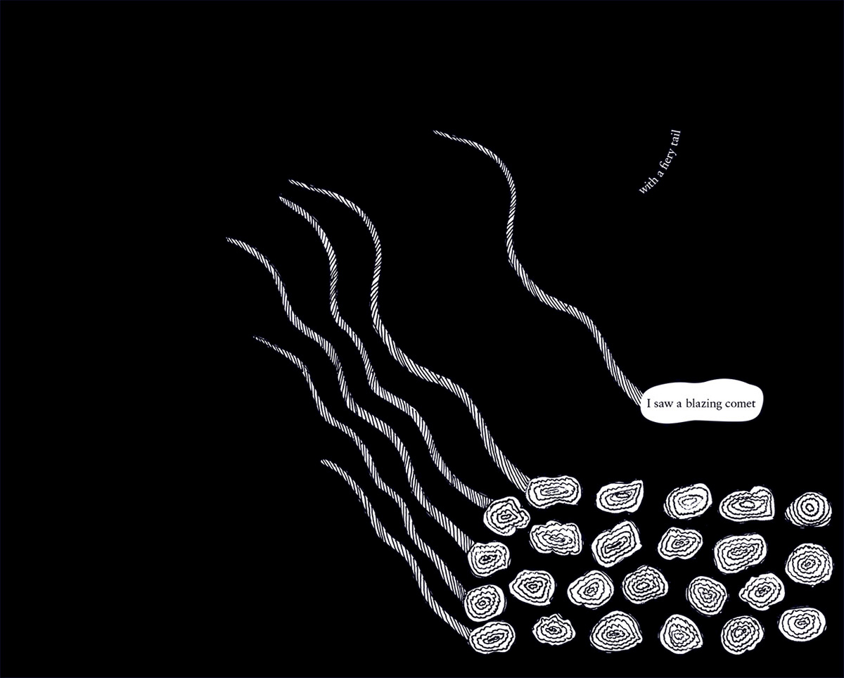
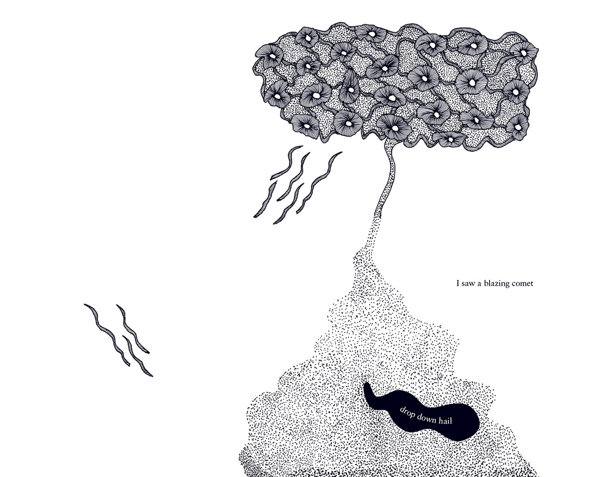
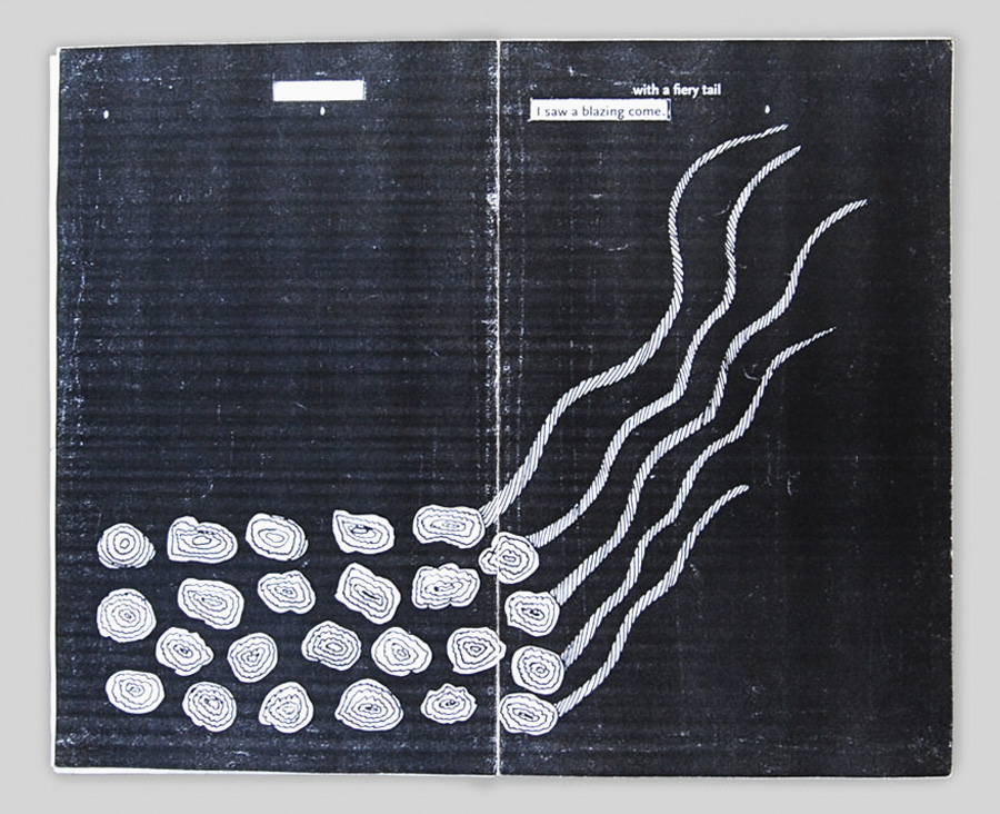
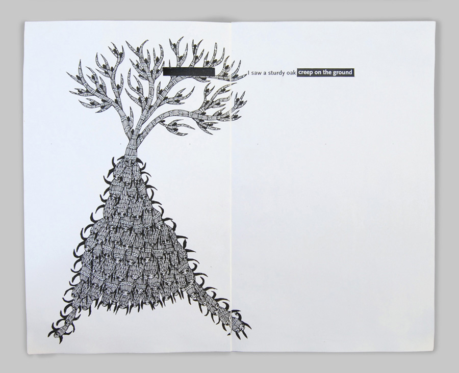
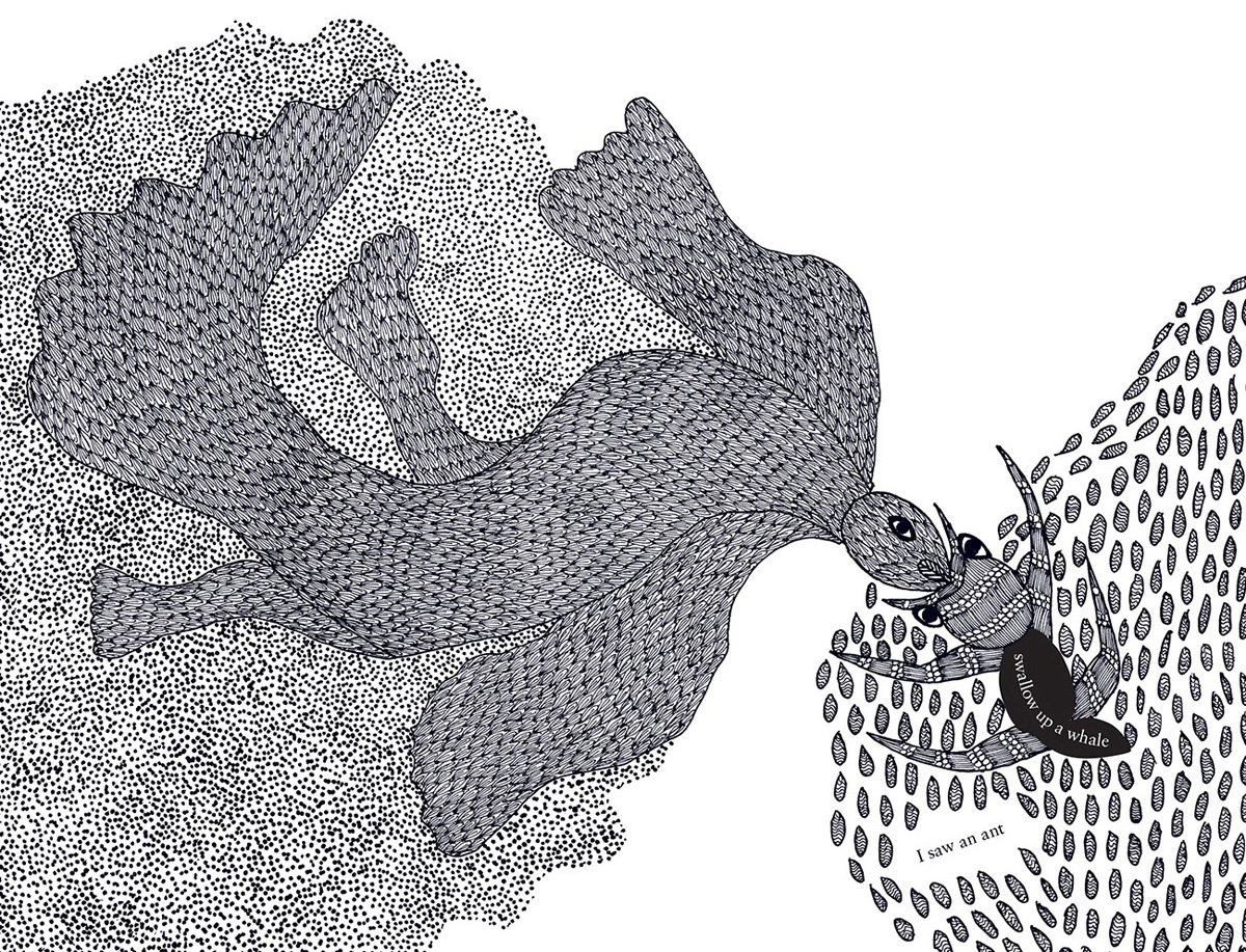
And that is how the second part of designing this book started. It was an exciting moment because I didn't feel lost anymore – the question became how to do something rather than what to do. Die-cutting had to be organic and add to the illustrations. Trying to find out which shapes I could use for the cuts on a spread was an interesting puzzle because the same shapes still had to make sense once the page was turned. So I was looking for common imagery that I could use. The peacock feather could become a comet's tail. The shape of a tear could also be the one of a flame. And again, when you're working on a poetry book, there is so much freedom. As time passed, the shapes became bolder. The book starts with circles and simpler forms that grow in complexity.
So we reached the production stage, and here a new challenge arose. Up until that point I had done several different dummies by hand. But it is one thing to make one dummy yourself – another story is to print 3000 copies of a book.
We were lucky to be working with a very attentive printer in China, but there were a lot of trials to work through. Because the book doesn't open entirely flat, some of the cuts moved, even only millimetres, and had to be repositioned. I remember some emails in which we asked the printer to move a circle one millimetre to the left. They reassured us and mentioned that part of the binding would be done by hand, and I guess it shows. The book was just beautifully done and we have to thank the printers for all their care.
My only regret about this project is the fact that I haven't seen Ramsingh's reaction to the final book; I was about to leave India when the copies were sent to him. I met him in Bhopal for a workshop in February 2010 and I found him to be extremely focused, introspective and very good at translating complex ideas into visuals. I hope we meet again and we're able to talk about his impressions.
I don't want to get nostalgic (if I start mentioning all the things and people that I miss in India, it might take a while) but I do miss the pace at Tara. I miss contemplation and working and reworking on projects. Obviously we always do and redo things, but there's something about time and the processes it triggers. I wouldn't have had the opportunity to meet some of these people if it were not for the extended period in which I worked on this book.
Images and short film © Tara Books.
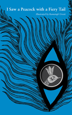
I saw a peacock with a fiery tail
Illustrated by Ramsingh Urveti
Designed by Jonathan Yamakami
Tara Books, India, 2010
A well-known folk poem from 17th century England, 'I Saw a Peacock with a Fiery Tail' is a form of trick verse. The poem at first seems nonsensical, but given a break in the middle of each line, begins to make perfect sense.
In this pioneering visual exploration of I Saw a Peacock, Gond tribal artist Ramsingh Urveti and book designer Jonathan Yamakami use art and design in the service of language. Working together, revealing and concealing, they brilliantly mirror the shifting ways in which poetry creates meaning.